Archive

Monthly Archives: July 2013


Hiroaki Samura’s epic(in the sense of it was coming out when I was in high school) Blade of the Immortal series came to an end this year.  And while in summation you’d have to judge it overly long, unfocused, and in some parts almost mindrendingly wasteful of it’s time on the page–you’d also say it did all of this with a style and grace that few if any other books matched.  Samura made long and unfocused look better than it had any right to.  And you stuck through the parts you hated because you knew when Samura wanted to give it to you, he could damn well give it to you unlike any other spot in comics.  He could do things on the page with composition, movement, rhythm, and figure that are simply without comparison.

One of the things that most fascinates me with Blade of the Immortal is his character’s movement.  Particularly the character of Makie whenever she has a duel.  Makie is the real star of the Blade of the Immortal series.  Her story and attitude is the most fascinating and interesting in the entire series–and her duels are drawn with the most creativity and expression of any of the fights in the series–which is saying a lot.  Samura imbues her movements with a genuine genius–it is enough that he tells us in the story that she is this otherworldy demon of the sword–but he actually shows it.

Makie’s fights are music.  They are a dance.  She comes at you in angles.  She comes at you in a rush.  A rush which is also a stillness.  A loudness which is also a softness.

To try and capture some of this rhythm I’ve color coded one of Makie’s fights.  The yellow panels are the soft panels.  These are the drops in the action where when pulled off right, create a sensation of floating for the reader.  The blue panels are the loud panels.  And then the red panels are the emcee panels–which are basically like on a mixtape when the DJ cuts in to tell you how: 1. the thing you just heard is impossible in it’s dopeness and 2. Like seriously did you hear that shit?

The emcee panel is a common trope in most manga adventure fights.  It is how they really ramp up the drama of the fight, and how they give the fight a narrative perspective within the fight.  It allows the reader to know that what they’ve just seen is oh so dope, and completely impossible–so impossible that even the way you actually saw it, you couldn’t see the true essence of it’s core dopeness.  It’s basically comics fight crack, and it is amazing it has never really caught on super well in superhero comics, which have a history of dialog during fights–but not much in the way of anything as keen as what you would see in even the most basic of boys adventure manga.  Anyways.

So those are the colors.

Yellow: Quiet
Blue: Loud
Red: Emcee

Oh yeah.  I also put in some circles so you could track the combination movements stitching together the beats.  

Check on that page how he speeds up the page with the first panel, just to drop it on the last two panels as he brings in the actual threat.  He stores up so much momentum with that top panel and it’s all there behind Makie’s back.  She’s got a whole page’s worth of weight behind her back.  Also Makie’s “these boring pitiable fools, who dare try to take up the mic against me” look.  That should have been a red emcee panel–but I think the angle of her head plays into the motion in the panel right after it–so I think it’s more of a pair with that panel and is the sinew which bolts the top panel to the last one.

The great thing here is that our expectations because of the previous page was Makie unleashing holy hell on this guy–but Samura delays it for a page–and transfers that motion into Makie’s leap.  He’s not giving us what we expected there.  There’s a cognizance there.


The pose in the top panel is almost a Makie signature pose.  Also sexual imagery like whoa.  And he didn’t even have to go T/A broke back to do it.  There is no tangible difference between fight scenes and sex scenes in comics.

Check the windup on that knee to the guy’s face.  That’s coming off her planted leg, which you can see she’s building momentum into with the swivel of that lead leg.  And then even as the blood is still flowing up out of the guy’s face as he pulls back, Makie is already ramming her blades into the sides of his head.  And again with that face.

And there’s your payoff.  But then Samura pulls us back from the fight, and lenses it through Anotsu’s perspective.  We go from really being right in the middle of the fight, to being far enough away from it to see it as the miraculous thing it is.

I love the juxtaposition there of Anotsu saying that Makie is dancing for him, but then other dude is the guy we see watching–and we see the horror on his face.  It gives what Makie is doing more of an edge, more of a horror, than if we had gone back to Anotsu or Rin there.

We then see the same butchering that Makie is doing almost incomprehensibly close–and obscured by more chunky blacks.

We come back out to Anotsu and:

Look at how much softer this page is compared to the one where the other dude is watching Makie.  The style of Samura’s drawing has changed to reflect a momentary narrative shift and moment.  And THAT, is your climax.

And then there’s shit like this…which…I don’t even want to talk about:

That’s some “I might as well just go back to making talking head comics” shit.

Anyways.  Dark Horse puts these books out stateside, and do a great job at it.  Probably skip the volume that has 90 percent of the Demon’s Lair arc(except for the end fight)–but otherwise…the covers are worth owning too.  Samura has an insane palette of oranges, blues, and purples.  Yeah go get those.  If this were a longer thing about Samura I’d talk about how he changed up his style midway through this book.  But who gives a crap really.

If you have to take Medium A into Medium B so that you can make enough money to continue to work in Medium A–there is something very wrong with medium A.

Medium A is comics.

—-

Selling out is when you do something you don’t believe in with your art, in order to make more money or get more famous.

Alan Moore didn’t need hollywood and it didn’t make his life easier.  He could not be more clear about that fact.


If you want to make movies, make movies.  If you want to make comics, make comics.  Don’t make shitty versions of both, just so you can be greedy.


There is making a living off of your comics work.  And there is I want to be a rock star, off of my comics work.

If the comics community did a better job of taking care of itself, people would never even dream of doing books like Before Watchmen.


Film money disproportionately benefits the writer of the comic over the artist, and often times film and television deals are structured to the detriment of the artist, so the writer can get paid on the other side of the deal for screenwriting–whereas the Artist gets nada.


When you draw someone else’s script, know that in 90 percent of the reviews or mentions of the work, your name may not get mentioned, and your work will largely go unnoticed critically.

Thus realize all of that work that you are putting in, is so the writer “partner” of yours can get the full page ad with their face and name, and blow up and live their dream.  Where if anything happens for you, it will be proportionately of less value than what has happened for your writer.  So realize that.


The two worst entities in comics are the publishers and the writers.  Much of the exploitation of artists is coming from these two parties.


The answer to comics isn’t to jump into film with both feet.  The answer to comics is to fix comics.  There was a time when people cared more about the artist of the book.  And in that time, artists could actually make a living wage drawing comics.  Hell, Rob Liefeld made millions without having to do much of anything but draw comics.

Comics as a medium can be popular again.  But it has to be artist driven, not writer driven.

Right now that’s not very feasable because of the way publishers are set up and the way the media covering comics is set up.

Right now I think the answer is that artists need to put more of an emphasis on being their own writer.  Even if you are shit at writing.  Most writers of comics are shit at writing comics.  That’s the dirty truth of 90 percent of the comics I see that actually make it shelves.  Trust me, you can’t do much worse.

But if you are both the writer and the artist–you are infinitely more likely to start recieving attention as a creator–and that does start to swing the pendalum I believe back toward people actually looking at the comics they are reading.  Which I think would bring a wider audience into comics.

Also to that end, stop drawing like everyone else.  Make a style so wild and worlds so unbelievable that you become undeniable.

I don’t know anything about anything, and am the least qualified person to probably ever talk about any of this.  This is just random things i thought while reading this Steve Grant article

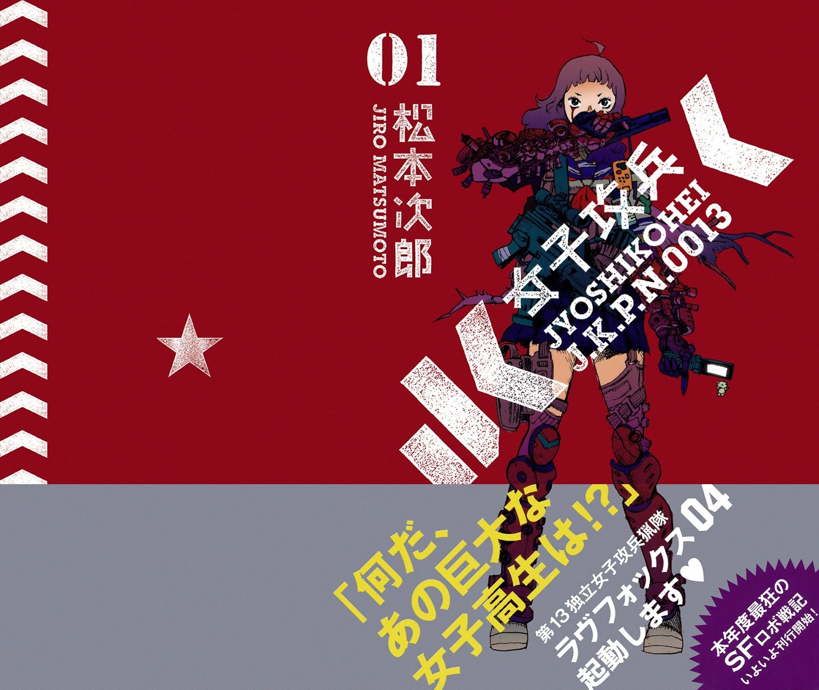
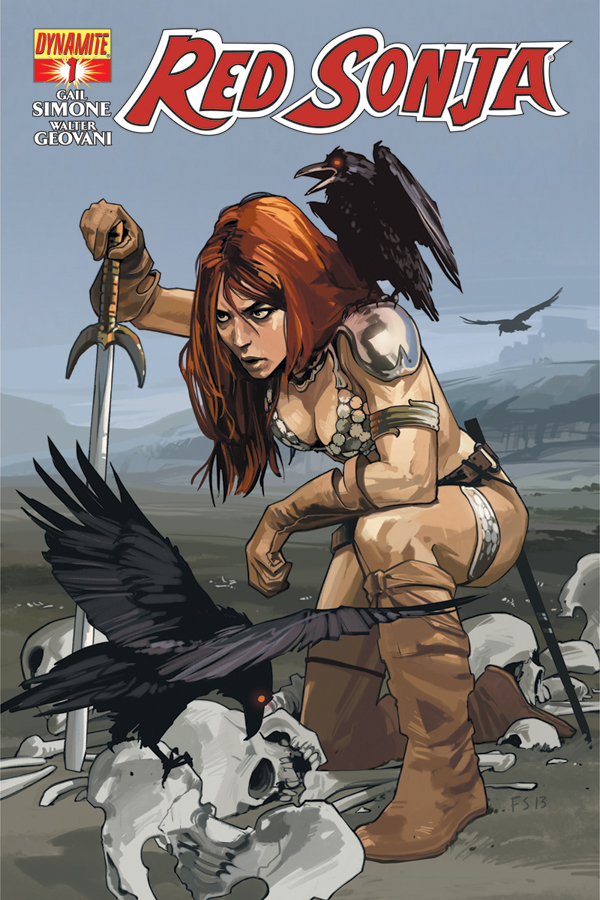
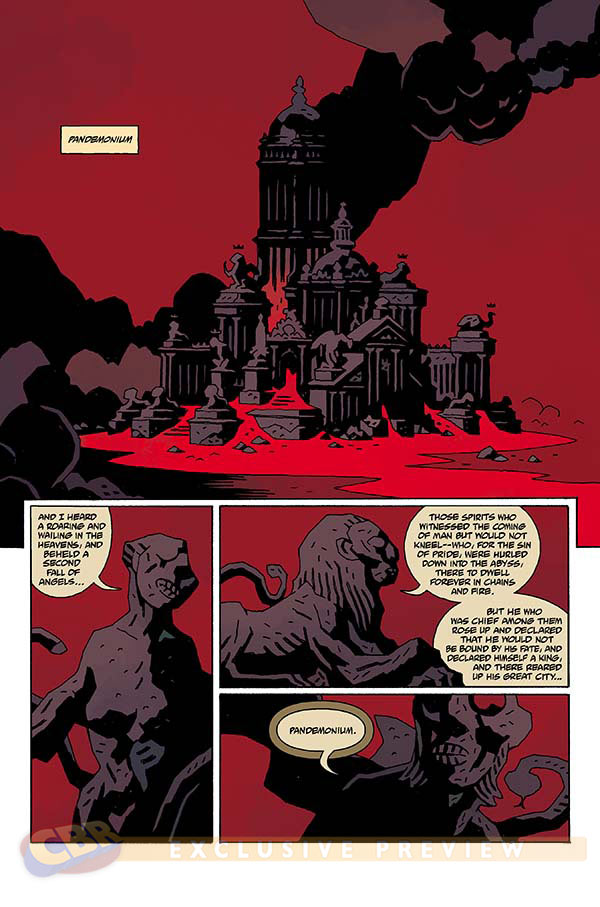
So Red Sonja got a relaunch this week.  Or I guess now last week.  And Red Sonja would be an example of a character that I am more interested in the idea of, and the history of, then the actual present of.  For the most part books like Red Sonja(and my super favorite example of this Vampirella) are being put out in the shadow of much much better times from before I was even born.  I don’t know who exactly the audience is for them at this point.  I mean I suppose mainstream comics wise, your female barbarian fix isn’t getting serviced in many other places, perhaps?  I also think these books are largely sold on their cover art–so I would imagine that’s where the bulk of the budget is going, so maybe it’s largely collectors who are picking them up?  I don’t really know.

But at any rate, when Gail Simone was announced to be going over to Red Sonja–I was kind of looking for an excuse to look at a Red Sonja book again, and sort of delude myself into thinking it could be anything like the awesome Red Sonja book in my head, or anything like the highpoints from Barry Windsor Smith and Frank Thorne(Ghita too).  Plus I am into a lot of metal where I could really use an absolutely brutal barbarian book in my life(Berserk?).  Intellectually I knew that wasn’t really what Gail Simone does–but at any rate I thought–I dunno, maybe some weird thing could happen where the writing, art, and coloring on the book could get to a level where I could at least sort of have a book of this ilk to read each month.


But what ended up happening, and maybe it’s predictable–but it’s part of what irks me about publishers on this level–the book just came off like everyone involved was just about being a pro, doing a pro job, and cashing the check or whatever.  I mean you compare it to any of Becky Cloonan’s recent sword and sorcery comics(which by the by, it is extremely weird to me that Brian Wood tells Becky Cloonan anything about how to do a Conan story.  Nothing against Wood–but Becky Cloonan is infinitely more qualified to write this genre than maybe anyone)–and it’s just lacking.  I mean even a book like Northlanders had a little more oomph.

And I don’t intend for this to be a kind of “buy this, or don’t buy that” kind of review.  I could give a fuck about comics as a purchase.  I don’t even really want to talk about this book in terms of good or bad.  Because that’s subjective.  Bad can be good.  Good can be bad.  I don’t really care.  My expectations are weird.  If people made comics like how I want them, then I’m pretty sure they’d never sell anything.

But here’s what I think.  I think if you’re a company that isn’t DC or Marvel, and you want to stand your ground–you don’t do it by putting out uninspired comics that are playing it safe and by the numbers.  I am almost a thousand percent certain that the people currently reading books like Red Sonja and Vampirella are not doing so because the content on the interior matters very much to them.  That was the great thing about like Vampirella in the 70s.  The stories were whatever.  Sometimes the writing was just terrible.  BUT the artists on those books completely went for it.  Fernando Fernandez, Jose Bea, Jose Gonzalez etc. just drew the ever loving crap out of those shitty stories.  Even the cover artists from back then are shaming the current crop.  

But so Simone’s script.  It is first issue of a superhero comic 101.  It’s interesting the initial set up–wild woman chained in the basement of a castle could have gone in a million strange and horrific directions–but it’s just a way for us to tie Red Sonja to this nondescript King we’re mildly supposed to care about–and it also sets up an antagonist that is revealed on the last page–in one of those “oh holy shit, out of the past” kind of final splash pages that I would fall out of my chair if a superhero comic didn’t start that way, just once.  I mean structurally the whole thing is sound.  There’s characterizing moments that endeer us to different characters, or are meant to.  But I mean…I think the effect here is that you’ve made this really fantastic and strange world that Red Sonja lives in, this brutal violent, almost alien world(there are people riding shark horses in the background of the last page) and made it domestic and mundane.  There’s nothing about the characters that surround Sonja which make them interesting or new.  They are largely archetypes that fit safely into a lot of the boxes that Simone has already established in books like Birds of Prey.  Compare that to a book like Prophet which came out also last week, every issue of that book introduces some strange new and weird concept, idea, or character.

But I mean, the writing on these kind of books is the kind of thing that just usually has to tick certain boxes so the art can do it’s thing.  Which there’s nothing wrong with Simone’s script on that front.

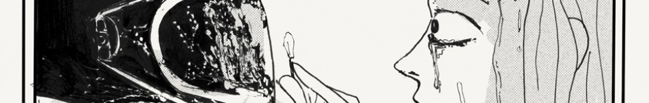
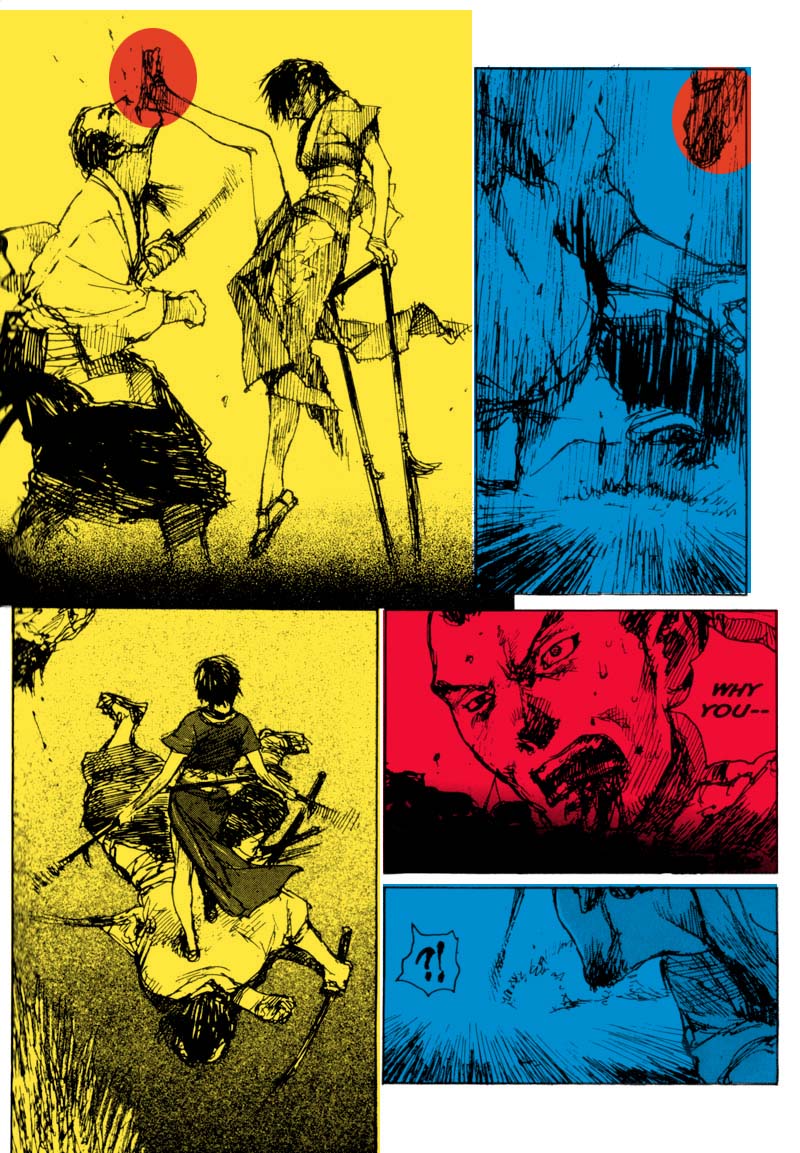
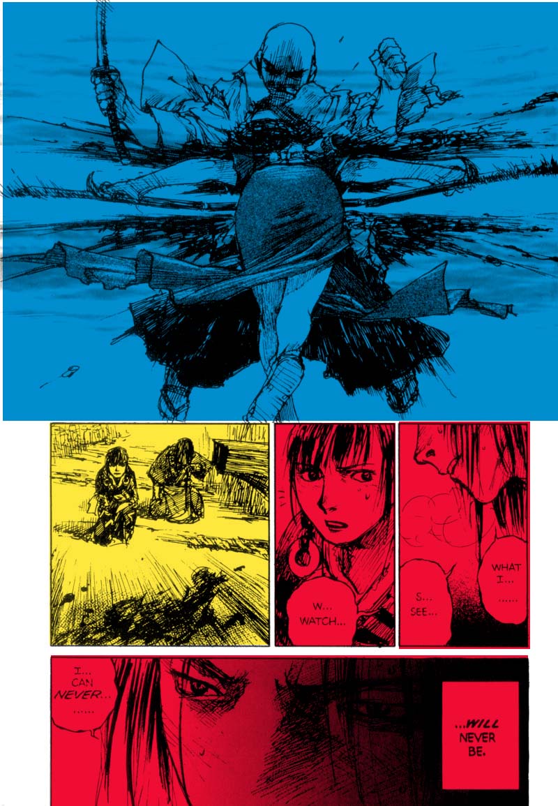
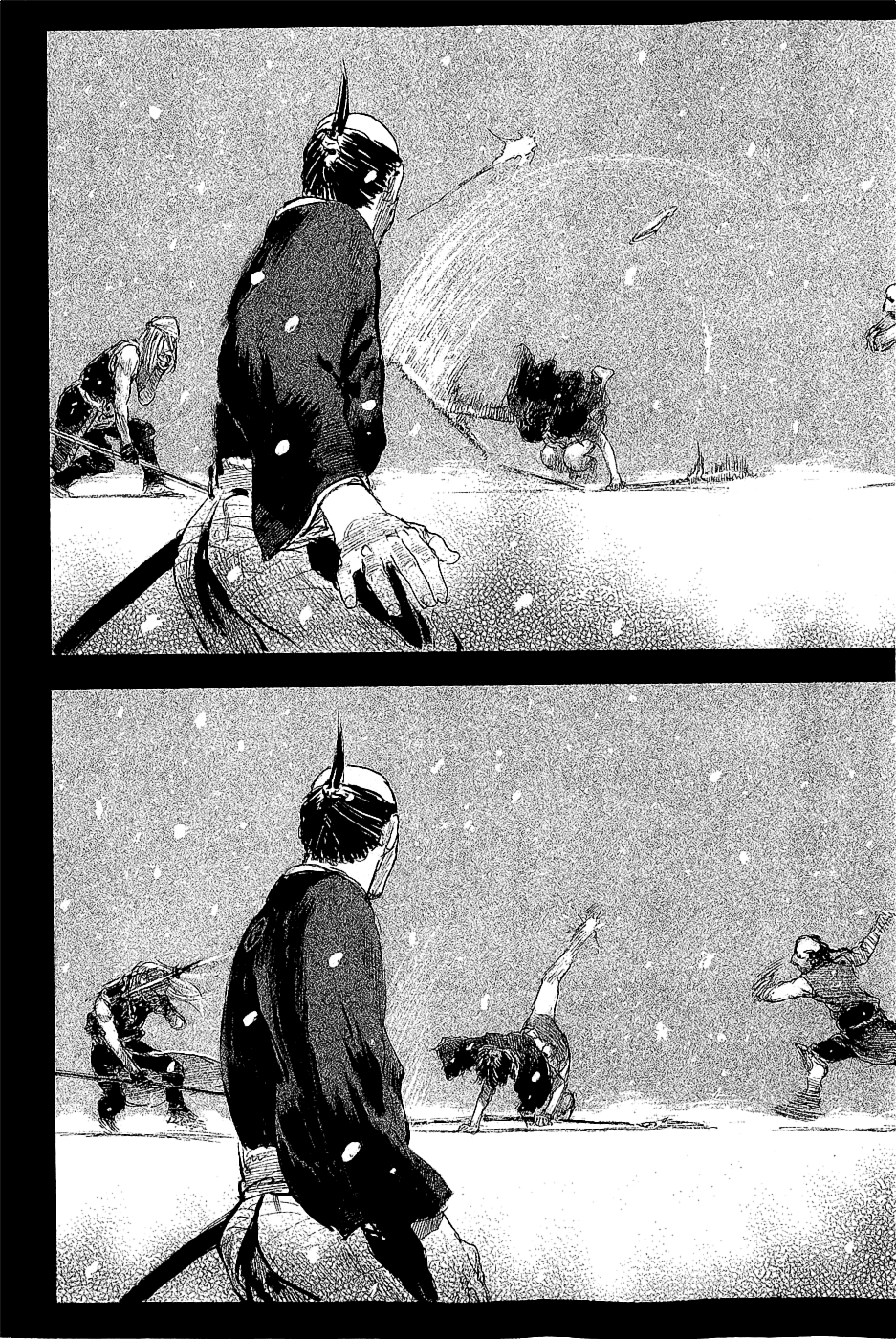
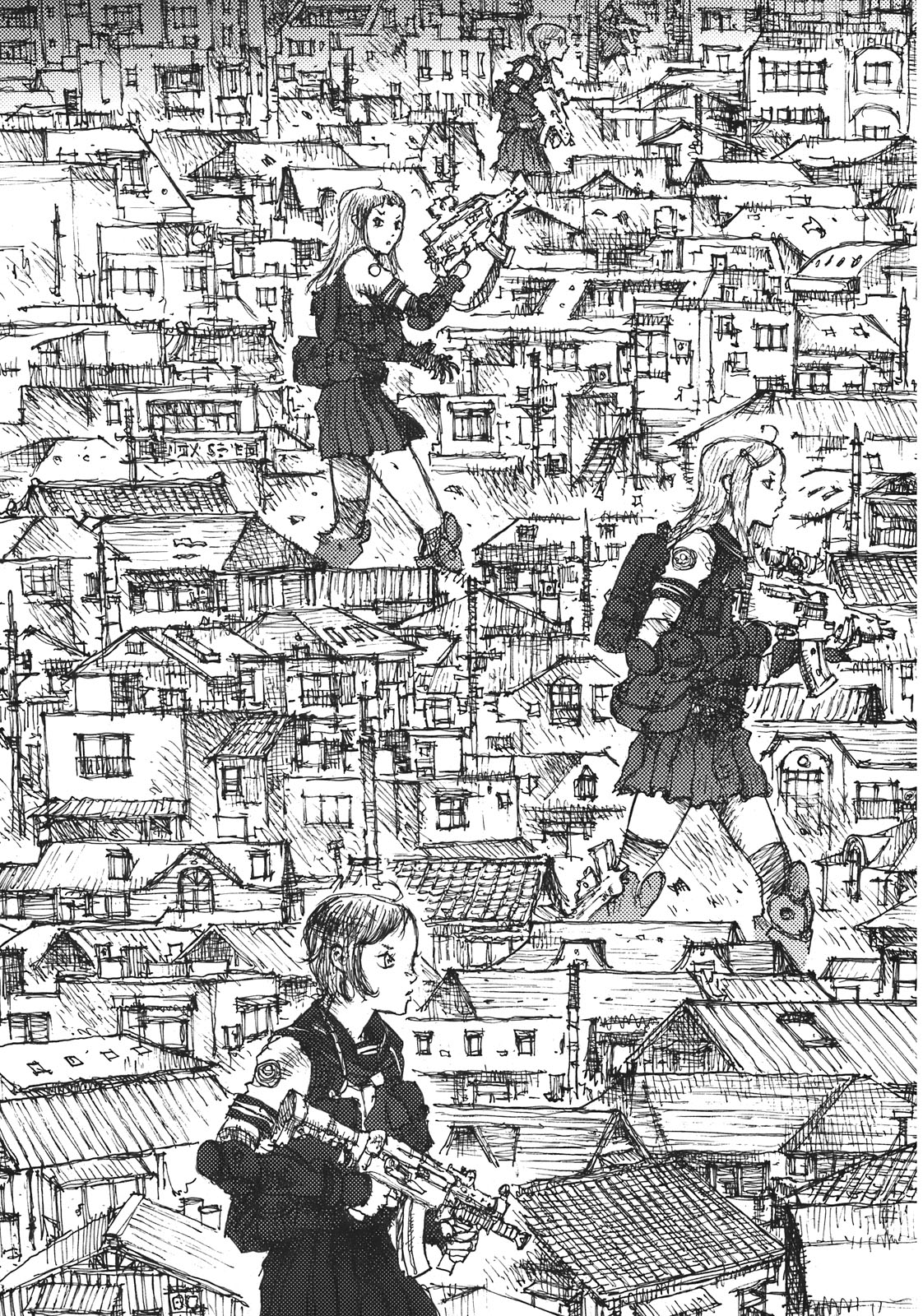
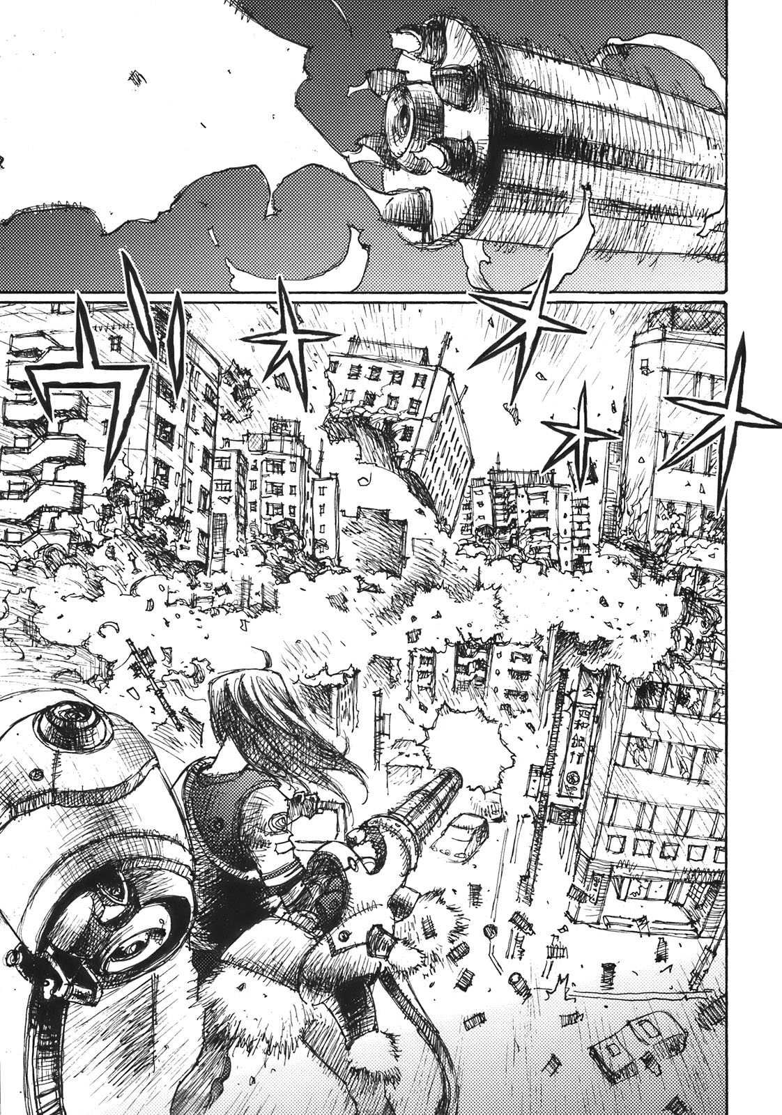
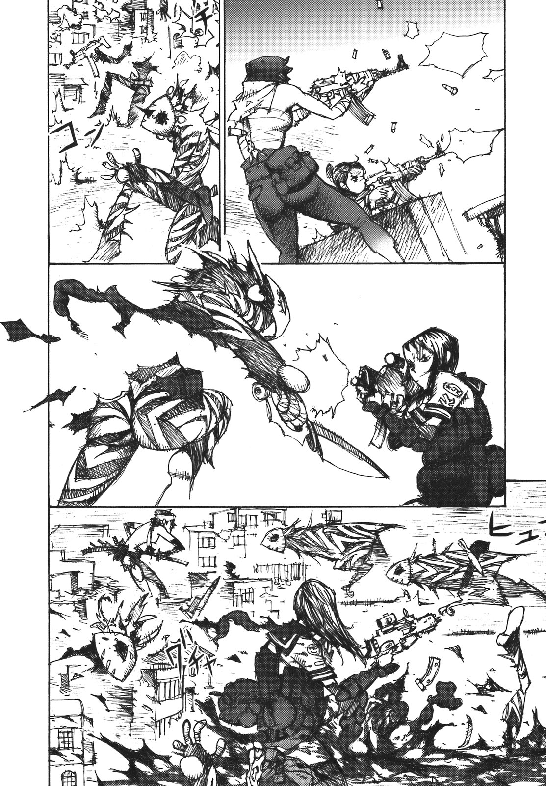
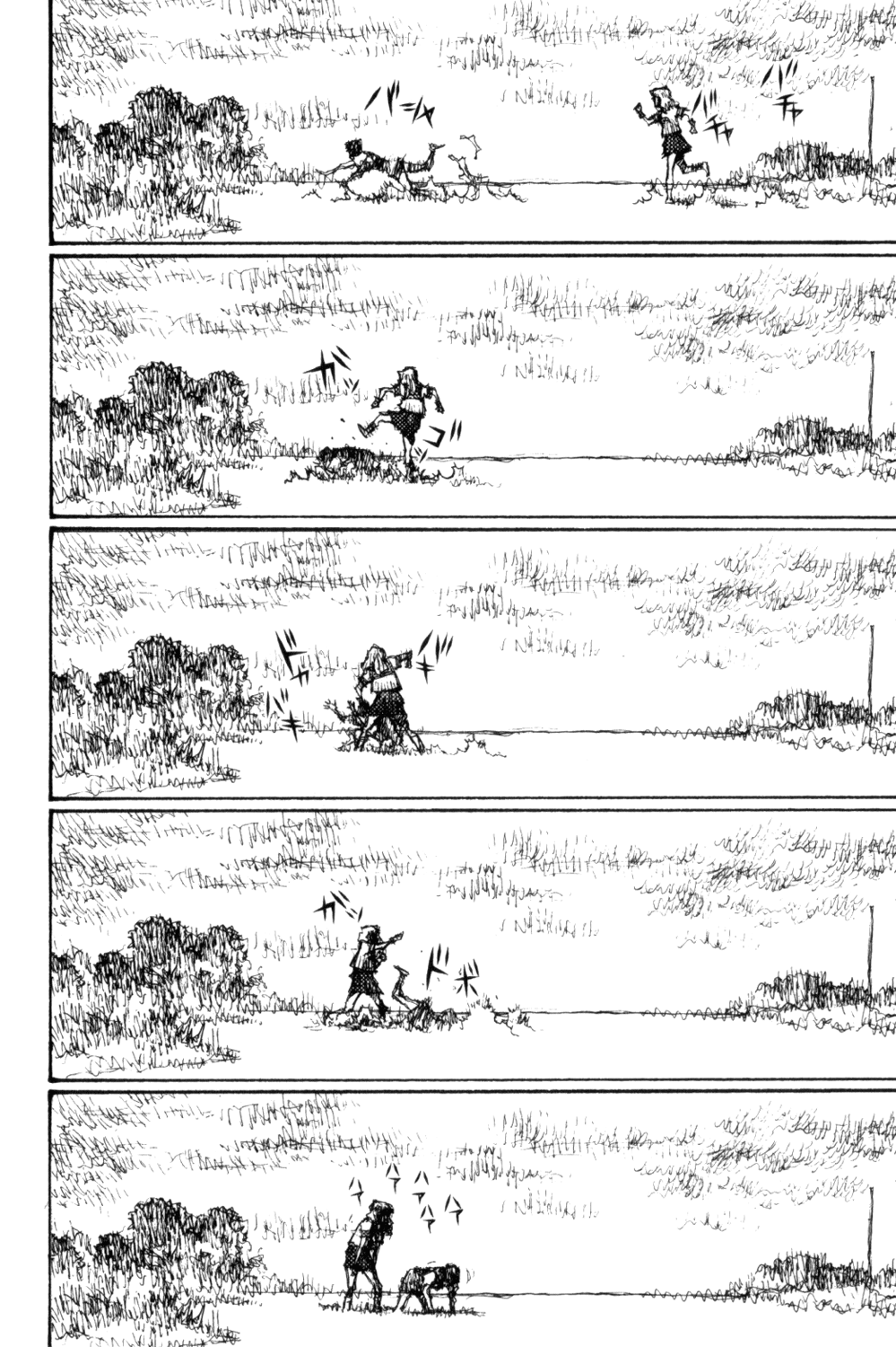
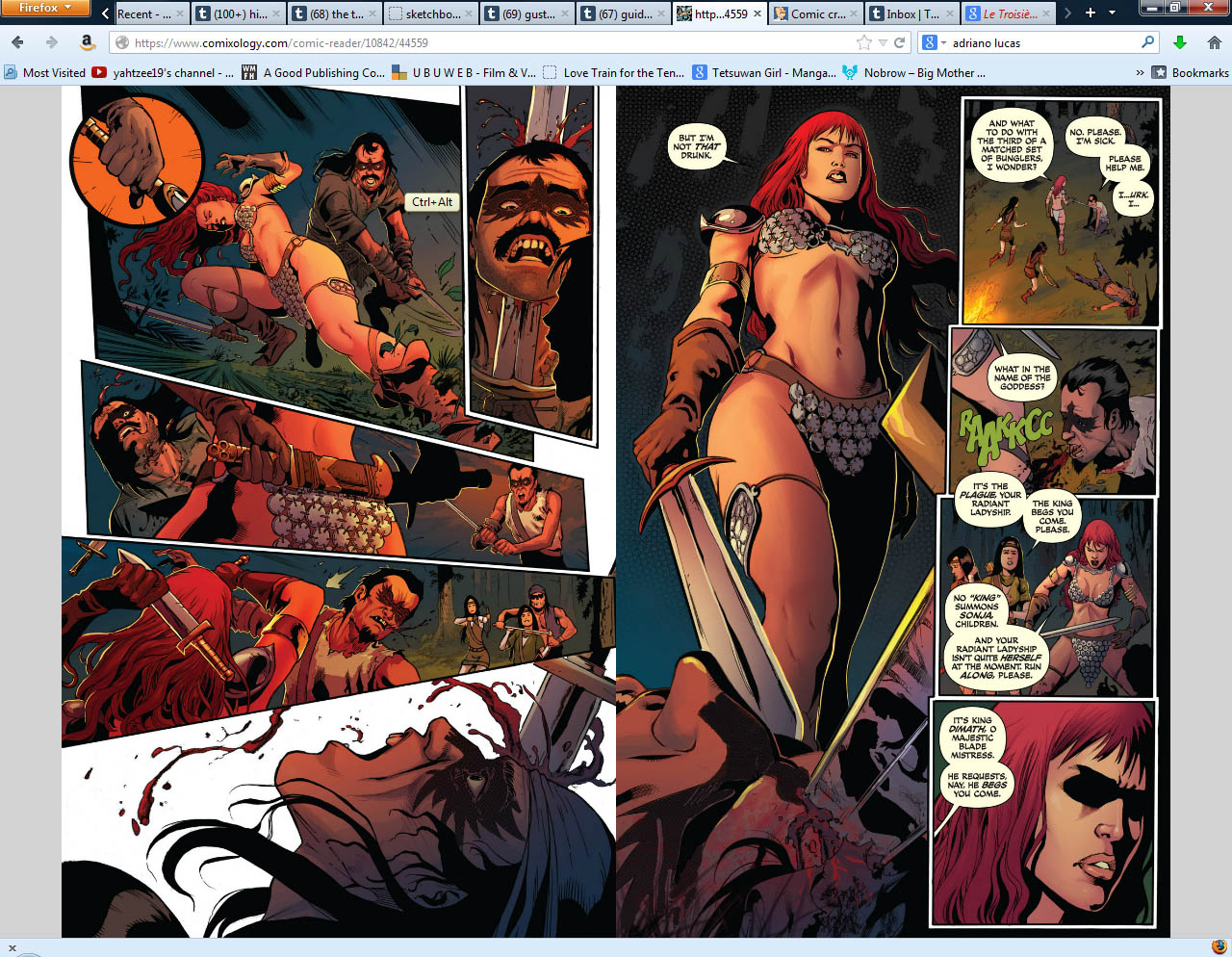
Walter Geovani is the artist on the book.  And it is difficult to really talk about his work because of the coloring techniques being applied to them.  Here are some just inked pages from the book from his deviantart page

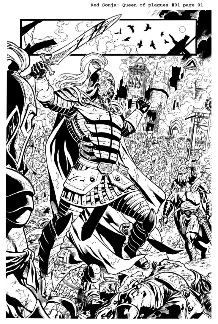
There’s some nice stuff going on with the high contrast between the blacks and the white space.  The character design is utilitarian.  He uses this halo effect off and on to pop different parts of his page out of the rest of the page.  I think for the most part when you are using such a heavy inked style–you are essentially about segmenting white space off into particular shapes and relations.  So what is going to make this style interesting or not, is going to come down to the composition of those shapes, and how you are transitioning between place to place.  A clear style like this should allow you to either create a lot of great empty space for color or light to really express itself–or it should allow you to put a lot of details on the page.

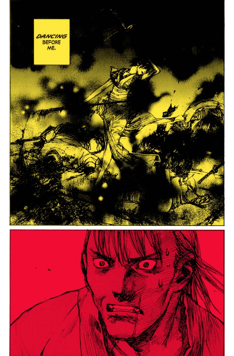
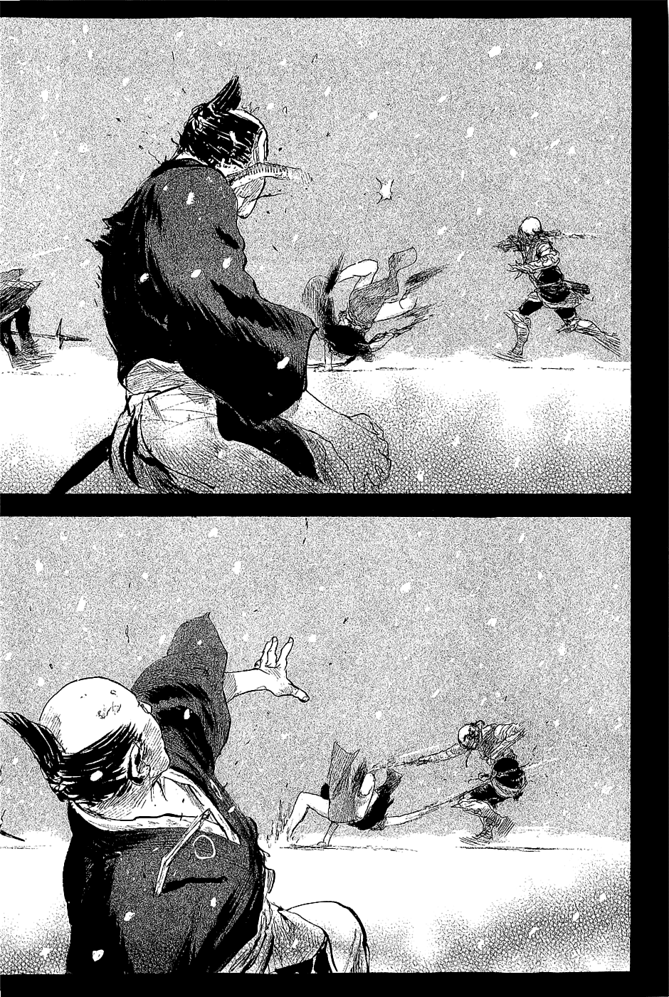
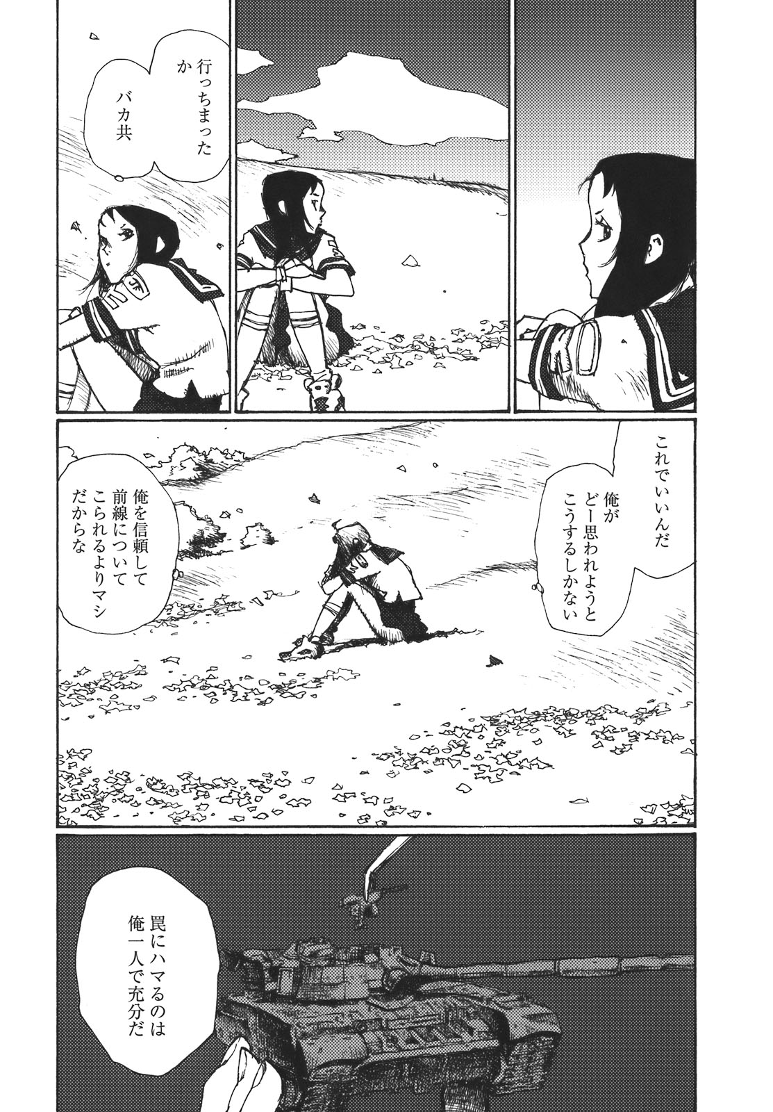
Contrast that approach to the one shown here by Esteban Maroto:


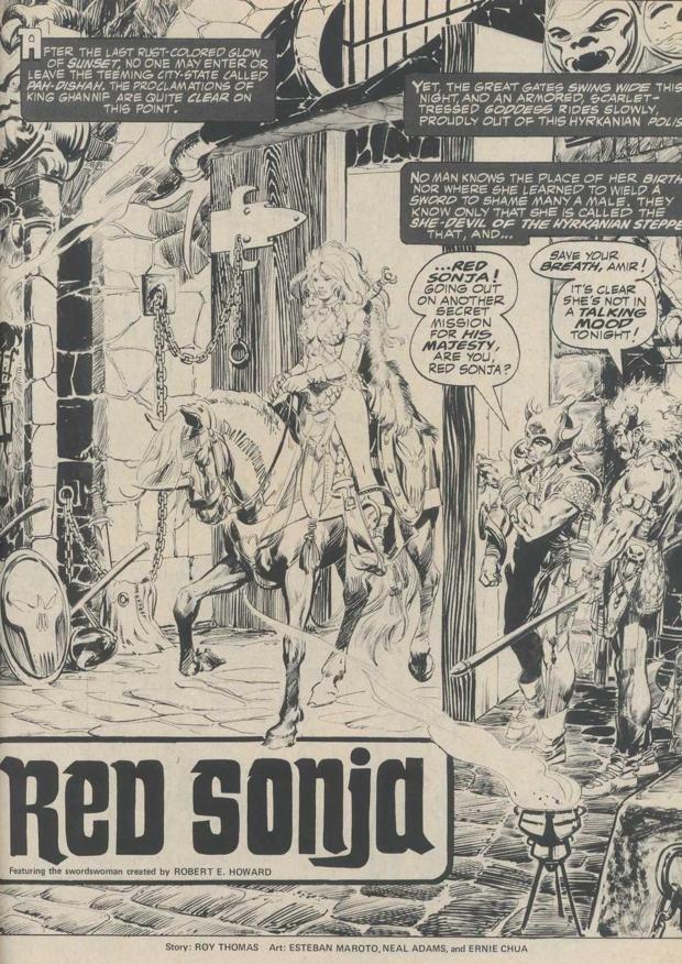
Here the ink is more expressive and it is as much about the texture it creates and the patterns it conveys on the page, as it is about denote shadow.  Also note how the varied line weight allows for an added dynamism to the characters on the right.  And also check the crazy designs going on on this page.  Every element has the weight of an original world behind it.  Even if it maybe wasn’t in the script–there’s a sense that Maroto has a world in his head.  Check the skull scabbard on the dude on the right.  Check the hilt on Sonja’s sword and compare it with the hilt on the Geovani’s sword.  There’s a fanatical passion behind these Maroto pages.  Maybe misguided because he won’t own the intellectual property rights or whatever–but still, dude can’t help himself.  Check the Breccia influenced texture on the stone on the bottom right of the page.  Comics…fuck yeah.

I’ve actually been thinking a lot about inking in comics this past week, for a few reasons.  One was this thing I’ve been reading Frank Santoro saying in various places(a real writer would put a link here) about how a lot of people in comics are just inking because they are attached to a process in comics history that doesn’t really have much to do with the aesthetic of the art.  It is more about just making your pencils darker.  Which now we have the technology where you don’t really have to ink your pencils to make an interesting comic.  So I’ve been thinking a lot about why we ink, and what the future for inking is.  I feel like these Breccia influenced artists, Hugo Pratt, Paul Pope, Caniff motherfuckers–like the way they are using ink is as another level of expression, and that’s the kind of thing that will never die out.  The beauty of ink as texture is still a thing.  However, this kind of thing–where it’s just inking to darken pencils–what is the future for this kind of thing?

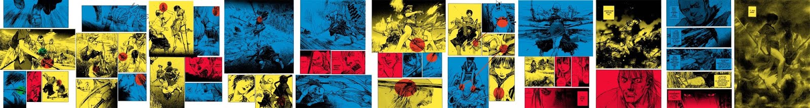
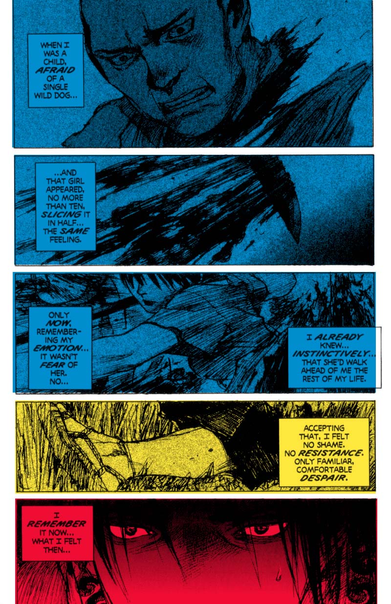
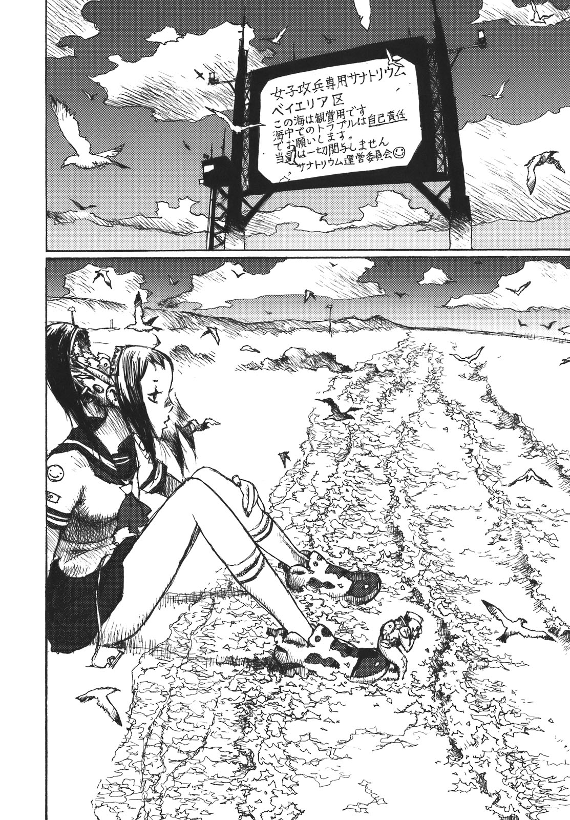
Particularly when this is what is going to happen to your work:


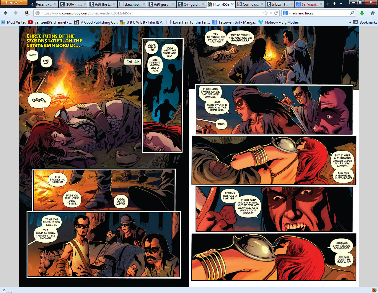
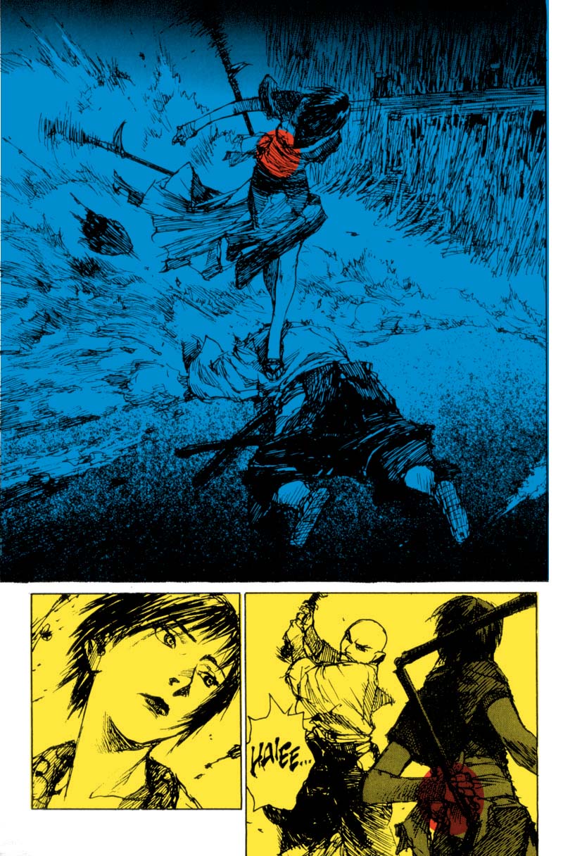
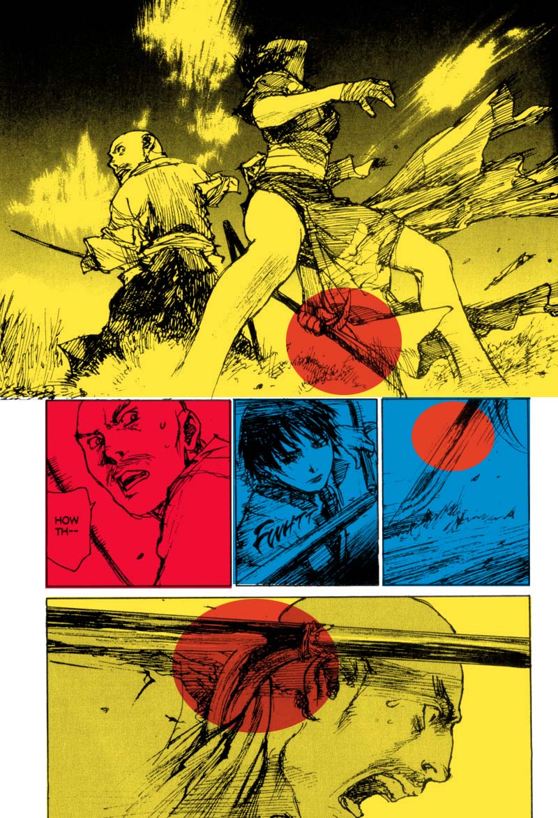
These are the colors from Adriano Lucas, and this is the kind of approach you see in a lot of Dynamites books–and just sort of–this is what is in vogue for colorists to do right now.  Which it’s done okay here if you first accept that this is a particular style choice.  Which is to say gradient style coloring that devalues the ink and line of the artist, to give primacy to the colorist.  With this style, the added visual information from Lucas’s colors obliterate the strong contrasting values of Geovani’s line work.  Which was probably his main strength as an artist on these pages–just the strength and bombast of his spotted blacks.  His blacks here beecome almost obstructions to the work Lucas is wanting to do.  Look at the shoes and blankets on the left page–those being black like that is something that rather than trying to highlight or allow to express itself, Lucas is instead seeing them as just another color on the page, and he builds his gradients into and out of that black.  Which is really absurd when you think about it.  Colorist is going to do these animation style gradients, and the starting point is that you have to deal with the color black all over the page, before you even start working.  The relationship is in conflict with itself.  The way Lucas is wanting to do this page is fundamentally at odds with Geovani’s inks, which have imposed upon him a color choice that may or may not even work half the time.

I mean if Geovani’s blacks weren’t there, there’s no indication that Lucas would change his approach–but I think his colors would absolutely pop more, and the choices open to him color wise open a little bit more.

When you have heavy blacks on the page,  I think flats are infinitely more powerful to use.  When an artist puts down heavy black inks–the contrast, why it’s dramatic is because it’s that clash of light and dark.  When you chuck gradient styles into that equation, you are watering down that relationship.

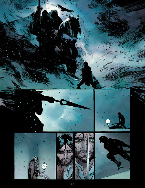
Look at this Dave Stewart page from Hellboy in Hell by Mignola:


By just using a few colors and no real gradients, Stewart allows Mignola’s art to hit and hit hard.

Of course part of the issue here too is that Geovani’s art is in this no-man’s land between heavy impressionistic inks like Mignola, Munoz, Frank Miller–and lighter cleaner line styles like Brandon Graham and Herge.  He’s not even in the territory of lighter impressionistic ink scratches like a Darrow or Milogiannis.  So it’s this situation where he’s not getting the benefits of gradients, but it is also questionable what you’d really be getting out of flats either.

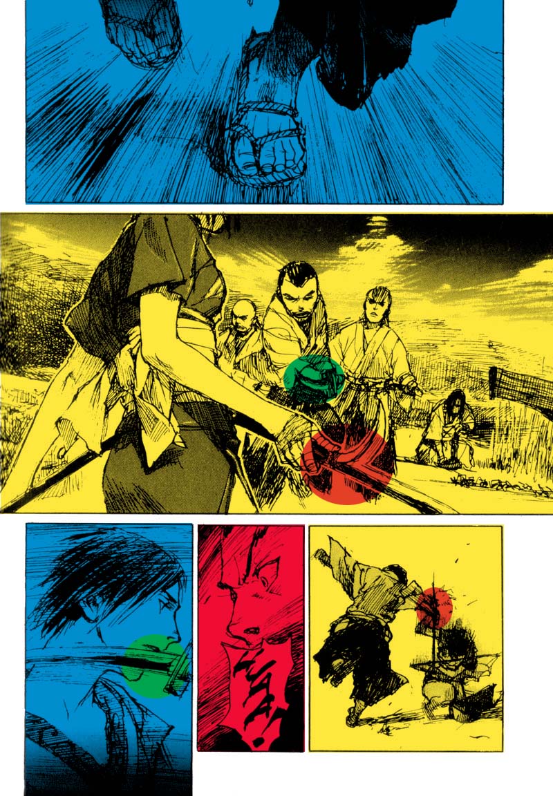
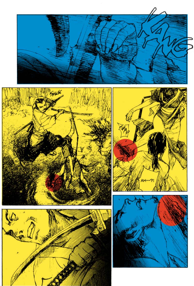
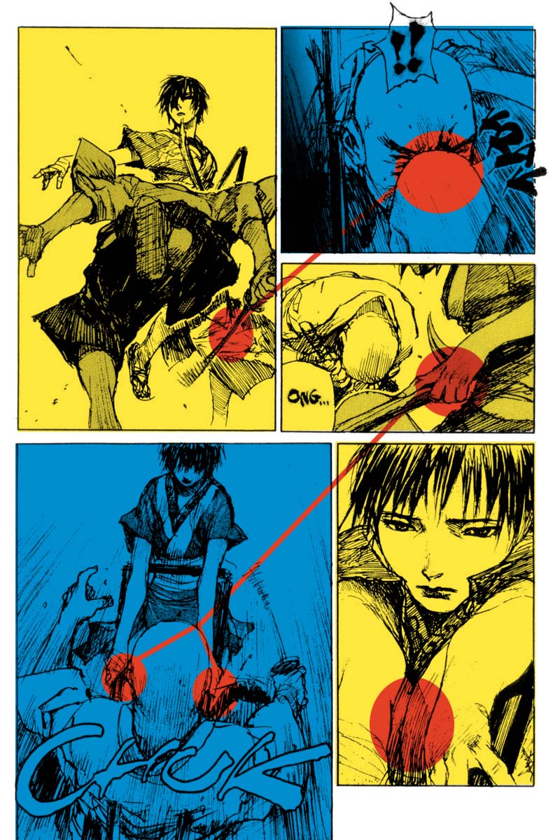
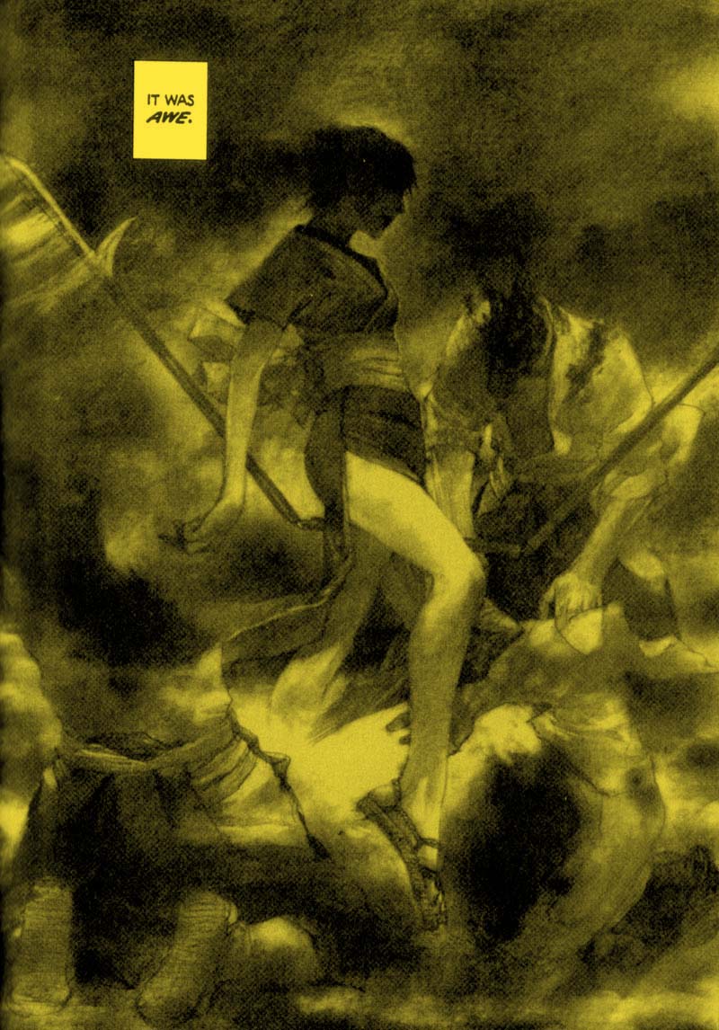
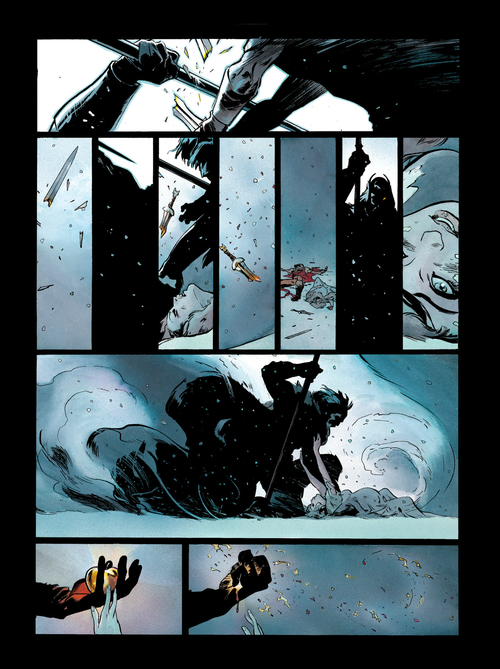
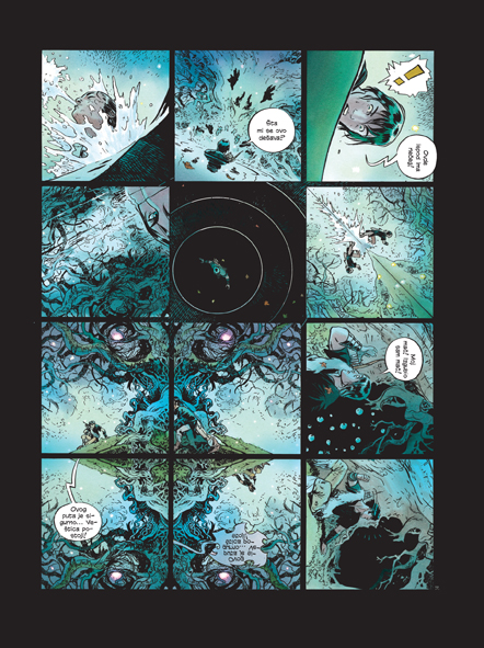
There are a few pretty cool pages in terms of composition.  This page on the left is probably my favorite page in the comic.


The way the first panel saws down with the motion of the sword swipe, and then then the second panel mimics the motion of the sword going up through dude’s face.  And then that cool pause on the fifth panel where Sonja is about to throw her knife–and we get the climax of that at the bottom of the page.  I also dig that flat orange background of that circle insert on the top left of the page.  Also you get that huge white space behind the panels which I think really does set off the color choices.  I wouldn’t mind seeing more of that kind of construction because I think the contrast of that white page sort of deadens the more offensive qualities of the gradients, while popping the color choices a  little bit more.  Sonja’s hair color in the fifth panel is pretty great, and how her arm is absorbing the red color from her hair.  It’s amazing to contrast the dynamism of the page on the left, with how dead and dull the page on the right is.  It’s crazy to me too that we’re rocking that ugly green grass color when since it’s night and there’s an orange fire, there’s like literally no reason to have to use that color.  I kind of dig how offensive it is too though.

Anyways.  It’s not a terrible book.  It doesn’t look completely terrible.  But it also pretty much everything that is making mediocre comics a staple of the american comic industry right now.  This is visually and storytelling wise exactly the kind of thing you would expect to read from DC, Dynamite, Top Cow so on, so forth, whatever.  

Here’s art from Alex Alice’s Siegfried book, Rebecca Dart, and Becky Cloonan…because whatever:


Also it’s hilarious to me that the colorist isn’t on the cover of this Red Sonja Book.

So what follows is the fragmented uncollected thoughts pretty much right after finishing Blutch’s So long, Silver Screen.  These are from my tumblr.  Mostly just saving them here for posterity.  Late in the week I will probably pick a section from the book and really get my teeth into it.  This is all just basically me drooling over good comics kind of deal.

Blutch’s So Long, Silver Screen brought over in english by Picturebox, is an incredible piece of comics.  Dense, witty, personal, poetic, beautiful.  Even if you only get a quarter of the film references it is stunning.  But if you actually know the films he is talking about and referencing, the cleverness scale sort of explodes.  I’ll have to read it several times to unpact everything—but even on the first quick, catching 20 percent of what has been said—it is stunning. 

It’s about loving cinema, but also loving through cinema.  Which is something I relate to very much.  There are also passages of just unfettered loathing for cinema as well.  Which is the kind of thing only a lover can write about film. 

My scans are a bit shitty.  I suck.  BUT.  I love this page.  As a single entity top panel to bottom panel the way it bends in and out of place and time and in a page tells the beginning, middle, and end of a relationship.  Beautiful. 

I got So Long, Silver Screen mostly for the art, I love Blutch’s I guess dry brush griminess on some of his art.  But this was definitely one of those books I got swept away by.  Was able to shut off the part of my brain that breaks down every page for the components that are most useful for my own advancement—and just enjoy the thing.  The writing was the kind of poetry on the page that I really don’t get to see enough of in comics.  This medium can be so so powerful when the words are right and the art is tight.  Like blowing up mountains kind of powerful.  The act of reading words over an image—like that brain process of juxtaposition and creation of meaning is one of my favorite things.  Like a, sometimes I turn on the subtitles for english movies, and mute them to watch them—kind of favorite thing.

But yeah.  Please go buy this book.  It would be cool to read even more Blutch work in English.  Peplum looks cool.

I should just learn more languages.

Much of So Long, Silver Screen is this essay meets dialogue between the genders.  Sometimes films are quoted as evidence of a particular point—and it’s just a redraw of the scene—other times the characters morph and change into elements of different films as they are talking, to underscore another point entirely.  It’s all very multi-dimensional.  Which when I write about this in a more intelligent and considered manner, is probably what I’ll focus on. 

It’s not so much the film references, as the structural bend of the comic form, and how it lends itself very well to this kind of immersive point making.  Blutch bends and contorts between essay and story form.  Sometimes it’s like American Splendor, dude just straight up talking to the reader—other times it’s a particular scene from life—but then the scenes and the monologues are all bent and contorted—there are things riffed on here, that aren’t even really the core focal point of the point of the page—but digressions upon digressions blending off into the background.  It’s so well considered as to be daunting.  The obvious comparison in English comics would be Alan Moore’s League of Extraordinary Gentlemen.  But where that’s kind of a pastiche romp boys adventure thing—this is poetry and thoughts.

I mean other people do this kind of thing.  Just saying.  This is what it is.  And it’s done really well and beautifully.

I think the way I’ve conceived of doing something like this was so much more dissonant and fractured and violent.  Blutch is a smooth ass motherfucker.

You can get the book wherever fine books are sold.  Also through the picturebox website.

Blutch, So Long, Silver Screen

“The danger in film is that by using a camera, you see it all—everything’s there.  What one must do is manage to evoke, to bring invisible things up to the surface.  Perform a sort of enchantment.”

Storytelling isn’t what you tell.  It’s what you don’t tell, but make the audience think anyways.

“So constrained an experience only finds its full reach beyond projection…when the memory of it returns.”

Blutch, So Long Silver Screen

“Michel Piccoli is the Gypsy of the wee small hours.  When all the women are named Helen, and the guys who haven’t gotten over their childhoods pull the wool over our eyes”

WRITING!  So rare to see it in it’s natural habitat anymore.

Blutch, So Long, Silver Screen

“Don’t count on me going on about how the rain falls in Claude Sautet films, the windshield wipers that squeak and the leave the windshield blurry…Or about the breeze in the sea—the damp locks of Yves Montand, beet-red from the sun…Schneider’s smooth yellow brow.”

“Cordelia!”

“No more than I would about Piccoli, chest brushy with herbaceous growth, Piccoli springing up like a virgin wood…”

And oh man the way that red pops like hell behind almost violent brush strokes.  No goddamn gradients here folks.  I also dig that at various points the shadows move around a character’s face—like the strength of their words or passion changes the light of the room.  It also creates an incredible isolation in that fourth panel on the second page—where the main dude is almost calling up out from an abyss he’s falling back through.  And then the textures of Blutch’s brush work.  The shadows on Cordelia’s face on the top two panels from the first page.  The way he’s done the folds of the bed.  *swoon*

Yeah then there’s this.

Blutch, So Long, Silver Screen

If after all that, you still don’t want to buy the comic…man I don’t know what kind of comics you read.  Jeez.

Watergate was the last meaningful political act of the American experiment.

In a culture where there is no journalism, where the political performers are created in labs of oligarch money even before you get to pretend to vote on them, in a culture where the government has access to all information on it’s citizenry and assassination and abduction are fair game—the only thing that matters is aesthetic.

To that end, right now, Rei Kawakubo, Yeezus, that Miley Cyrus video are more politically relevant as a resistance than anything Noam Chomsky has ever written.

Edward Snowden as a failed piece of political art.  Almost immediately passed over and jeered off the stage—boring in the face of everything.

We are through the eye of the needle already.  There is no stopping that fact.  The forces which are arrayed against us are already entrenched in a constantly adapting kind of new wave authoritarianism that is beautiful in it’s hateful and mechanical geometries.  Politics as we now know them are a reality show created by the elite to give us the illusion of power in a globalized system so all encompassing in it’s fractal design that simply removing any one player from the field only creates the space for a new one to take it’s place, and for the design to cut off that avenue of future power.

Our ingenuity and adaptability has been turned against us.  Someone was talking about new fonts that are being written so PRISM can’t read them—but even in doing so, they admit that the shelf life of that is so small as to be infinitesimal against a system that is rapidly growing like a virus as it experiences new forms of threats to it’s being.  We are all becoming part of the PRISM.  We are the structures of our own labyrinth.

So the political piece of art is nothing but a pastiche of a more simple time.  You can watch transition period Godard now in the same way you would read Paradise Lost.  It’s beautiful in it’s poetry—and it’s aesthetic directness—in the same way that a brutality building now has aesthetic weight, almost divorced of it’s original transgression.

I think the move is to evolve our own minds beyond our current understandings of these strictures as they exist currently.  We have to divorce the words of all of their meaning in totality, and give over to the horror of our circumstance—becoming mad and insane beyond reason and political action.  Not revolution.  But apocalypse.  Up has to become the same thing as down.  Food has to become the same thing as excrement.

The eye of the needle is past mattering.  What matters now is the way that the form of the needle allows us to perceive light waves and not what it means to mean that we can perceive these things and discern them—but what it doesn’t mean.

I don’t know what I’m talking about obviously.  Basically Obama is the political equivalent of when your friends convinced you to click on that two girls one cup thing.  And the only way we’re getting out of this mess is using aesthetic to lobotomize the thought processes that got us here.  Because the patterns we are using are flawed.

A lot of the slower mediums I think,l this is where they maybe fail us.  You’re not going to get a major motion picture that is going to come up with the new idea that blows our minds up.  It will be something like a pop song, an 8 second or less video, fashion—maybe a comic book (hope hope).

Basically I want Ales Kot to write the autobiography of Edward Snowden comic, and it just to be Raf Simons shit for page after page—and like Dziga Vertov Group influenced haikus or something.

Again.  Totally just waiting for the oven to preheat so I can put a pizza in it and go to sleep.  I try to know as little as possible about what I’m talking about before I talk about it.  That’s my ninja way.  I don’t know how you do it.

So this week I read Jiro Matsumoto’s Velveteen & Mandala, put out by those purveyors of excellent taste in manga, vertical press.  I am starting to get to the point where I will just start buying whatever manga they bring out sight unseen, because their track record in bringing comics by artists that I adore is that strong.


Jiro Matsumoto is a guy I’ve known about for awhile, and I had read some of Velveteen & Mandala before–but this was the first time I really sat down and committed to finishing one of his works.  I have also pawed through Freesia and the City of Honests and Heretics–more interested in the latter than the former.  I have mostly been trying to steer into stuff that he’s been doing post-Velveteen & Mandala, because I think there’s a maturation of his art style in that book which is where it pivots into something I am super super interested in.  Freesia and Tropical Citron are the two earlier works I have at least looked through, and both though appealing, lack this new found punch of the later work he’s been doing.  Or I guess–the work he’s been doing now.


To that end, rather than discuss Velveteen & Mandala like a normal sane person would do, I am going to talk about this book Jyoshikohei that he did starting in 2010.


Jyoshikohei is a manga about these mechs that look like high school girls and fight other giant girl mechs.  It’s sort of like Attack of the Titans, but written by a maniac with a schoolgirl fetish.  Actually the whole women who are giant mechs thing is probably a whole subgenre and there’s probably some kind of fancy name for it in Japan.  Regardless.  I don’t really care about any of that.

THIS, is what I care about.  What strikes me most about Jiro Matsumoto and the main reason I’m starting get obsessed with his work is this particular kind of tension in his images.  The tension between the heavily rendered figure and the barely rendered background.  What is beautiful to me about this choice is that it tilts the weight of the image so totally onto the character–because they literally have more lines on them.  And by not following suit with the background buildings and structures–his comics have a lightness and an agility that other comics don’t.  It would be a completely different, and decidedly less dynamic image in the above situation if he had hit those buildings with heavier inks, more hatching, and heavy shadows and greytones.  By frontloading all of the values of the page onto his characters it gives them a primacy on the page that is really exciting.

Plus there is an airiness to the buildings now.  They look even more fragile by comparison.  Like they are almost held together with wiring and good intentions.  I really love this kind of method for drawing architecture, because I think sometimes the rendering we do on architecture to make it seem more real–strips away the beauty of it’s shape and form.

Take this Schiele sketch of some houses.  There is something captured here about the essense of these buildings, and their shape.  There is also a stronger sense of their relationship to light, even with less direction given through heavy rendering.  Negative space is a beautiful way to depict space.

The fallout from these more delicate buildings, is that when Matsumoto starts blowing them up–the way they warp and bend as they fall down or explode–creates this insanely violent, jaggedy, shrapnel kind of destruction.

And then when later in the book the buildings get hit with blood:

The effect becomes much more dramatic.  Also this technique lends itself to a much easier expression of curvilinear perspectives, which allows for a more dynamic and alien aesthetic.  


To that end, Matsumoto’s sense of pose for his characters, and the angles he chooses to draw his characters from, creates this wonderfully severe comic.

That lean in the top left panel, creating this really cool sideways glance out of the corner of the character’s eye is really beautiful.  As is the framing of the bottom two panels.  This is how you create cool on the page.  Also note how he is moving in and out in terms of his values between background and character, panel from panel.  The bottom right panel really pops because it has that stark blank, white background, and the character now has adopted the shadow which was used in the previous horizontal panel above it.  And then the next panel right next to it, you’re back to that greytone background.  So he’s created this framing mechanism with his values, that are working directionally with the panel’s construction, and allowing him to really pop that image right off the page.  I mean the girl’s head also slightly comes out of the panel–which if you notice, it’s the only moment on the page where the image is breaking the panel.  So that one panel has the entire page titled into creating it’s effect.  It’s the kind of thing that is a part of the magic of actually reading a comic.


Taken on it’s own, like if I just cut that image out of it’s page–the image doesn’t have quite it’s same quality.  But within the context of the magic of your imagination and how your mind perceives the connection between images–it is stunning.

We can see a similar effect on this page, where that top left panel almost seems to hang in time, because of that grey background.  He has also grouped the top section of panels and put them just a little bit over the bottom section, which is something I talked about a bit with Rob Liefeld’s X-Force comics awhile back.  It creates a kind of spatial distortion on the page–and allows for a certain kind of weird concurrence to happen in your reading.  It’s like how when you have two windows open on your desktop(a reference that will date this entire article in five years)–they are both running concurrently–but one is running in the background.  Your eye is drawn to the top window–but the bottom window is still happening, and you still perceive it.  But it s in a different place.  You wouldn’t get this effect without that slight hanging down of the top part of the page over the bottom.

So then when Matsumoto drops a page like this, where none of the panels overlap–the rhythm really hits a cool spot.

Also note in the top panel the lean he’s given that girl and the angled bend of the building–the suggestion of a cityscape without the actual cityscape.  That angled horizon.  It slides you right down the page.

Everything in his comics leans and bends, and angles down and around the page.  His composition comes at you violently and spins you in all kinds of crazy directions.

And then his jittery line itself–which, is the type of line you draw enough times, people start to wonder about your sanity, and your drug habits.  The anxiety and freneticism of his line particularly in his work from 2009 and up, is incredible.  I have talked about this often, because it’s a common thread in the kind of lines I’m drawn to–but these are the kind of lines which project a psychosis.  These lines are more personal, but they aren’t warm lines.  They are defensive, and guarded, and it is almost as if they can barely sit long enough to depict the figure that they are depicting.  With Schiele his art has an almost disturbing sexuality to it for people, simply because of the line.  Matsumoto is in this territory.  In some ways, there is more of a madness here than a Taiyo Matsumoto comic, which is almost more stately and refined in it’s line.  This is maybe more in line with what you see maybe Giannis Milogiannis in his art here in the west.  Or maybe early Jamie Hewlett?    Even then those comparison aren’t really that accurate because I don’t think any of them have this kind of madness in their line.  It’s more a shared cousinhood of technique perhaps, rather than mindset.  Though Hewlett is probably close to that.  I mean Nihei has some of these techniques, and Q Hayashida as well–but it comes across way differently here.  With Hayashida and Milogiannis there is almost a kind of grime sometimes that comes across.  This isn’t grime.


Sienkiewicz is who I think of really.  Even though obviously this isn’t nearly as experimental as coked out 80s Sienkewicz comics.  What is really weird though is with some panels and layouts of Matsumoto–I think Peanuts, and I really don’t know why.  There is sometimes this way he draws–like in the above panel the way those shoes are done, and the way the pilot is drawn crying there and then the hills in the background–maybe it’s not peanuts–but newspaper comics in general.  LIke there’s a krazy katness there–like where Matsumoto has broken slightly from one thing, and bent into this other territory of fucked up innocence and simplicity or something.  And not in a chibi kind of way.  But in a Ignatz kind of way.  I haven’t figured out what exactly is causing that weird juxtaposition.

Really it may be as simple as saying that it is a side-effect of the simplified way that he draws elements on the page.


These last two pages are from Velveteen & Mandala.  They maybe speak to what I’m talking about.


Anyways.  Yeah.  Jiro Matsumoto.  I like him a lot.  Go buy Velveteen & Mandala.  It’s a beautifully weird book.  It’s like a Based Dogtooth.  Plus if you buy it, maybe Vertical will bring even more of his work over.  Plus it is only one edition, so you’re not committing to like a 40 book never ending series.  It’s like 350 pages of self-contained comic goodness.

There is not a comic that burns things down in a better looking way.  Matsumoto is literally playing with fire.