Pretty Deadly is a comic series put out by Image Comics with art by Emma Rios, Coloring by Jordie Bellaire, Script by Kelly Sue Deconnick, letters by Clayton Cowles, and edited by Sigrid Ellis. It is a supernatural western comic that nods to exploitation and pinky violence genre films. Issue #1 available now at where ever.

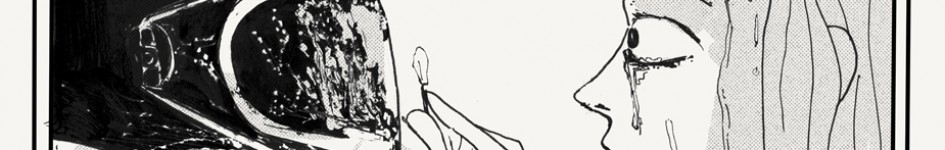
The above image is of Meiko Kaji, the actor who became famous for her ability to manifest vengeance and wrath on the screen. This is from her film series Female Convict 70: Scorpion. She is also famous for her performance in the series Lady Snowblood. Both series are based upon manga and involve a central female character being trapped within a prison, being hardened by the experience, and then forged into a weapon of vengeance against the ills of the surrounding world.
The Lady Snowblood series is perhaps the most interesting of the two because the central character, Yuki, is born from the mother who is the direct recipient of the rape and violence, that will shape her quest for vengeance. She is a tool of her mother’s vengeance, even though she did not directly witness or experience any of the wrongs herself. In this way, the film pivots from being about a singular trauma to being about the culture of trauma. She is not just avenging a singular rape, she is avenging the totality of rape and the way that it poisons for generations the surrounding wells. What Lady Snowblood is talking about is the construction of a transgenerational trauma from which Yuki may never fully escape. Both Lady Snowblood and Female Convict 701 are about engaging the ways in which these traumas imprison, but literally and figuratively, and both create a kind of horror in them, that as many people as are killed, and as much as the protagonists might struggle, there is no escape, and they can only fall farther and farther down their prison walls.
In the backmatter section of Pretty Deadly, Kelly Sue Deconnick relates a dream she had as a child where she and some friends are being chased through this dream house, and they keep running up and up, until they end up on the roof of this house, their pursuer hot on their heels. Her friends keep running though, and soon fly right off the roof off into the sky leaving Kelly behind on the roof because she is unable to fly. She has become trapped in space that is fast evaporating as she turns to face her pursuer.
It is this key motif of confinement, of retreating from space, into the constricted confines of one’s own inability to continue to run, that informs every level of Pretty Deadly.
Beginning first with the basic construction of the book, which is a frame narrative(though even within this frame, there are frames within frames, even within just this first issue) that acts to box the core story even further within the comic beyond the front and back cover. The interesting thing with the frame narrative device is that even as it constrains the core story within its boundaries it portends a much wider world than the one which we are exposed to and traps us without it. This theme is rife through Pretty Deadly, which has in it a vast world of old scores, strange oaths, and shaky alliances that shimmer no closer than the middle distance of the page, backgrounded behind the world’s primary focus. This serves to exacerbate the oppressive sense of enclosure that Pretty Deadly wars against. If you want to make a prison, you put tiny windows in the walls, because the worst thing about confinement is freedom. This world’s flesh is further constructed through the detailed hypertext of Emma Rios’ character designs, which evoke all kinds of different contexts and worlds parallel to the world of Pretty Deadly. Besides the Meiko Kaji references, we get things like Ginnys skull facepaint which links up with The Knife, Big Alice’s hulking McCabe and Mrs. Miller fur coat. Beyond that the designs themselves all hint at larger stories and mythos. Sissy’s vulture cloak and different colored eyes are at once as cool, as they are mysterious. These details both serve to characterize, and function to create a desire to see that which has been refused to us. These are windows in the cell walls.
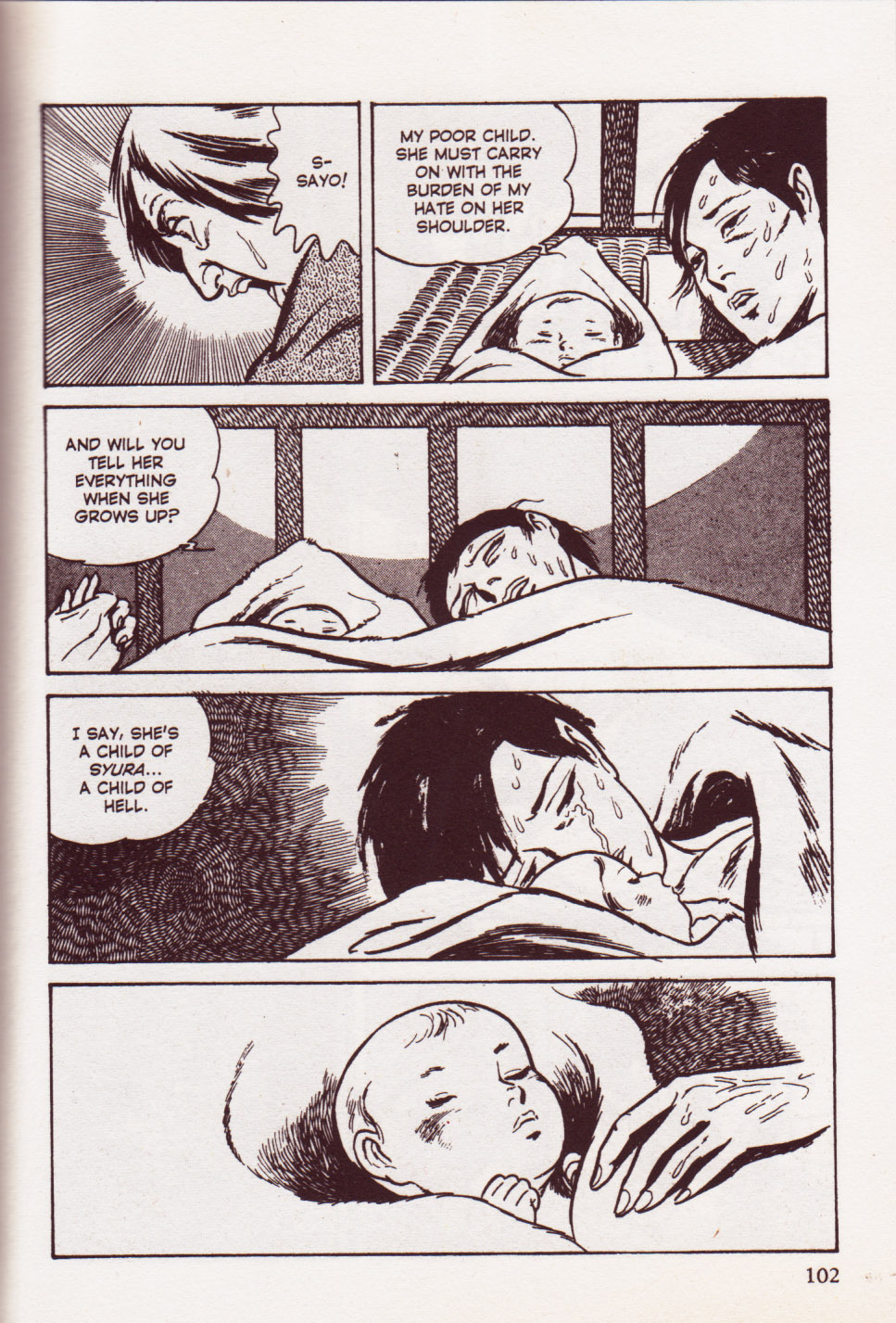
The conscious interpolation of Pretty Deadly is significant to mention because it is the fundamental backbone on which the origin story of Ginny Deathface. Ginny’s mother represents the fairy tale disney princess myth of the beautiful woman trapped in a tower awaiting her knight in shining armor. In a perverse twist by Deconnick, the knight in shining armor happens to be death. It is worth noting as well, that here Rios has drawn death with a skull mimicking the skull on the above Meiko Kaji Scorpion poster. And then as in Kauo Koike/Kazuo Kamimura’s Lady Snowblood the mother dies in childbirth leaving behind a child to be raised in hell, to walk a path toward vengeance. In this way, Ginny never really can leave the dark tower, because she is always tied to her vengeful blood. The tower is now where ever she is. This undercuts the knight in shining armor/prince motif–because even though the prince came, the trauma could not be taken away, and was instead then passed onto the next generation.
—-
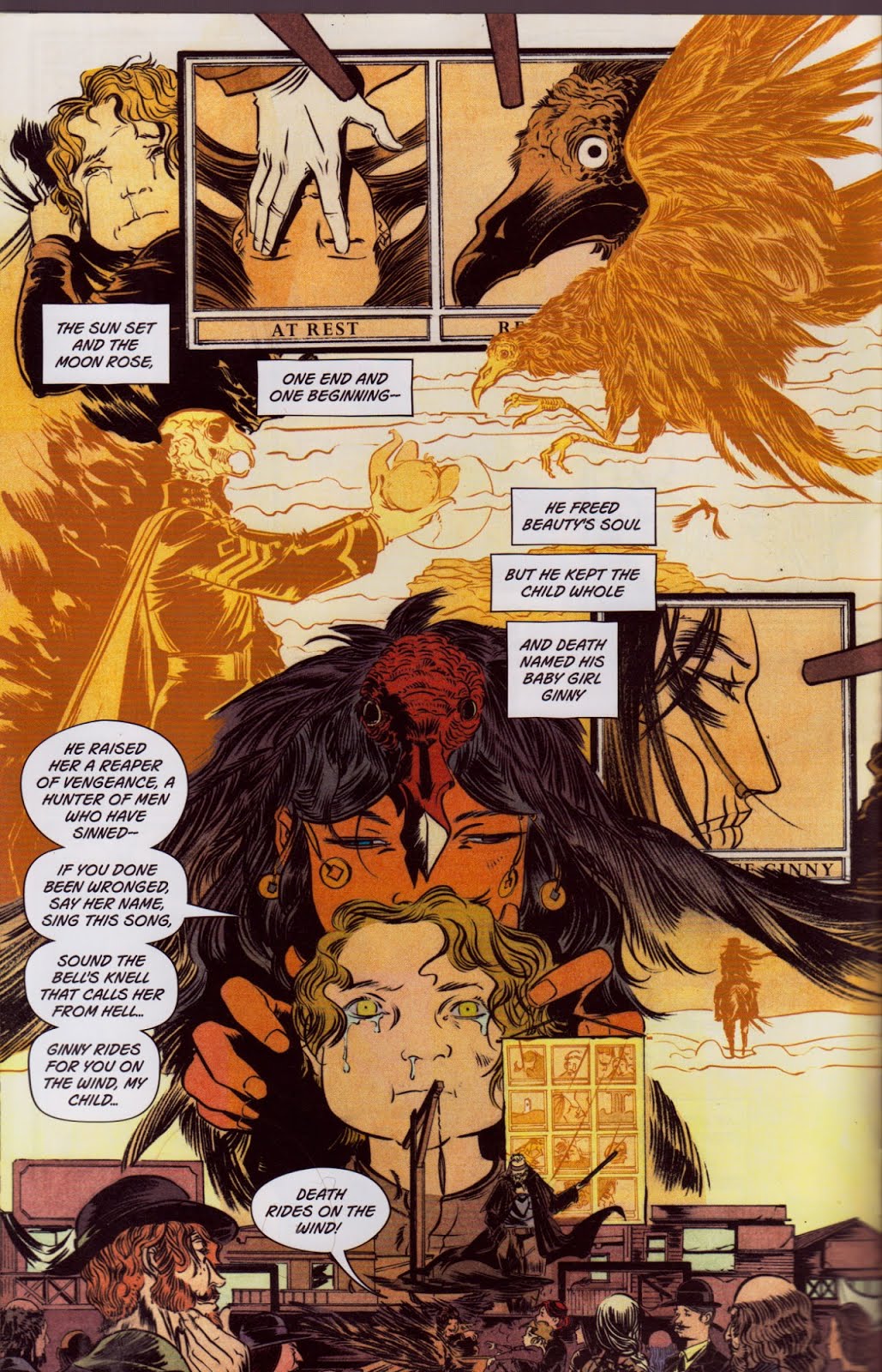
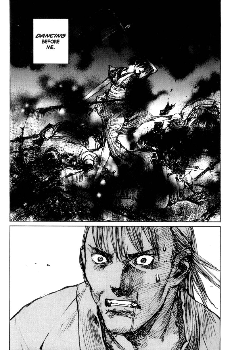
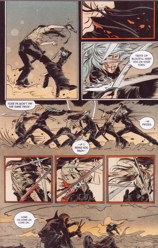
The interior narrative of Pretty Deadly opens with this montage of Ginny Deathface’s origin story as told by Sissy and Fox through a twelve-panel grid comic that they unfurl and hang from the gallows. Just in case, you needed a more over mission statement of just what Emma Rios is doing with page layout and composition in this comic.
Rios’ page composition in Pretty Deadly functions primarily as a tension between the rigid grid system that is favored in much of western comics, and the montage/animation/collage of images and time that make up her strength as an artist. Every page in Pretty deadly plays on these elements of constructed tension, but in this page you get the thesis statement. She quite literally has the traditional grid system of comics drawn up on the gallows–and in this section of pages she plays around with the constrictive nature of that system and how its rules are at their foundation simply about the management of time and composition, and allowing imagination to animate the movement between those moments. Look how she stretches out the panels from the traditional grid that Foxy is pointing to at the bottom of the page–usually your mind fills in the gaps between panels, but Rios has instead filled in those gaps with all of the story that wouldn’t fit between those grids–this is the world beyond the traditional bars that make up the comic page. She is playing with the core magic of how comics work both to press against its walls and by contrast in the following pages, show how regressive the other approach can be. What makes this all doubly impressive is that she has two different montage sequences going at the same time, but from completely different places and time, and they are laid over the top of each other in between these traditional panels. All moments, both at once, and singularly.
For the rest of the comic Rios operates in this 2 X 3 pattern oscillating between liberated full bleed open spaces, and dark thick black gridded squares and rectangles that entrap characters in the way a Leone Close-up does.
A similar game is played with the coloring by Jordie Bellaire. Bellaire sections off Pretty Deadly into smaller and smaller segments, simply by her color patterns. There is a chaptering effect that creates these almost concurrent parallel worlds within the book. There is the world where Sissy and Foxy sit in a blue and purple desert, where pink ray guns zap out at them from the shadows, and then this is next to a world of yellow, orange, and brown where Big Alice trods heavily up a saloon’s stairs. All of this separate from the amber yellows and golds of Ginny’s mythology story, which is completely separate from the present netherworld that Ginny rides through at the end of the book, almost devoid of color.
This page is probably one of the more grid-restricted pages in the entire first issue–but it does show you somewhat the 2 X 3 sectioning I’m talking about. On this page it’s two open sections cut up with 3 paneled sections. So the bottom section bleeds down off the page, and has an insert panel within it, and then the top section fades out into the white space on which the top bank of panels sets. And then you have the three sections of constricted grid panels–1) the top two rows that are above the middle open section, 2) the middle rows that are on top of the middle open section, and then 3) the bottom insert panel which is cropped by the page cut. As I said, this is a formula that for the most part informs the layout and composition for most of the rest of the pages in the book. This is the baseline on which Rios is bending most of the notes of the book. The construction of these rules allows for a perception of their modulation–you can see the walls because they are uniform–but they are more vital than a rigid traditional panel structure like in a book like Watchmen. There is a soulfullness here. The blues had soul because they were the expression of liberation with the constriction of the few notes being used. To bend a note is to express pain. Soulfullness comes from pain. Comes from trauma. Bronson’s harmonica in Once Upon a Time in the West. Skip James. There is musicality here in the format. But it is a blooded musicality.
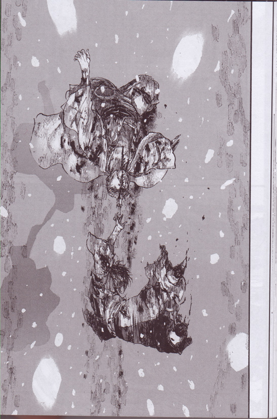
Another element of this restriction is the way that Rios consistently has her top and bottom panels cropped off by the page cutting process of having them printed. They are clearly drawn for this effect. Not only does it add to the claustrophobia of the work, it also creates a tripping exploitation film type stutter to the pages. she invokes a tripping stuttering film roll–every page kind of stutters into being–and besides this, it creates a sense on each page that you are kind of hitting the page running–that the world has already started moving before you have arrived–and that you are always turning the page just a hair late. Which again falls in with the idea that not only are the characters imprisoned within the book, the pages imprisoned within the book, the images imprisoned within the book–the very act of reading the book imprisons you without the book. You become cognizant of your own inability to reach fully into this world. The only page that doesn’t have this cropping on it is th the last one, which is of Ginny Deathface riding alone through some sort of ash swept snowy other world–I mean it’s not a literally a netherworld–but the impact that is set up because of these choices–creates a netherworld on that last page.

This page, which comprises the first of two pages which are sort of the climax of Pretty Deadly’s styling points also represent its cage at its most constructed. Notice how on this page the building itself plays a part of the paneling. Note the door frame that Big Alice just squeezes through is drawn just like the a panel itself. We see the door as another window out of the imprisonment of the comic world, and we move farther and farther away from it. Notice how the sink from the top open section bleeds down to create the door frame and cut off the lower open section. On these pages, even the open sections swirl in on themselves and create boundry. Notice the wobbling effect of how the panel with the guy in bed jitters out to the left past the edge of the open section, and then provides the new outer edge on the right side of the page, which folds down into the close up of a bloodshot eyed Big Alice. Again bent notes. Rios is playing with the rules of the pages to this point. And using them to squeeze tighter and tighter upon the space the comic inhabits. There’s a slight blurring on, where even as the open sections swirl to contain each other, the way the same sink that closes in the lower section, bleeds over the prostitutes hair, causing her to almost pop out of that gridded panel–the rules are defined, and now they are bending.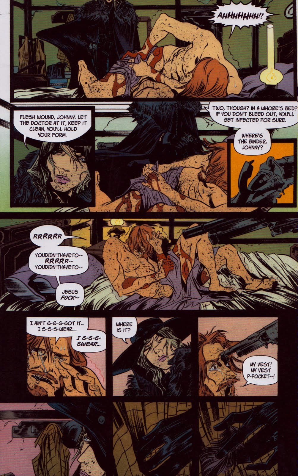
In the second page, the borders of the room itself ape the panel borders and create a prison barred effect that oppresses further and further until at the bottom of the page you just get one big thick black bar on which the panels are squared. Also the way Bellaire pops that panel with the gun by dropping that orange in there–which causes a slight jitter in your perception, as it forces you to the right of the page, before coming back in with a gun only slightly less black than the border it protrudes from, coming the complete opposite direction, whipping you back toward the middle of the page. This is the claustrophobic tension informing all of Pretty Deadly.

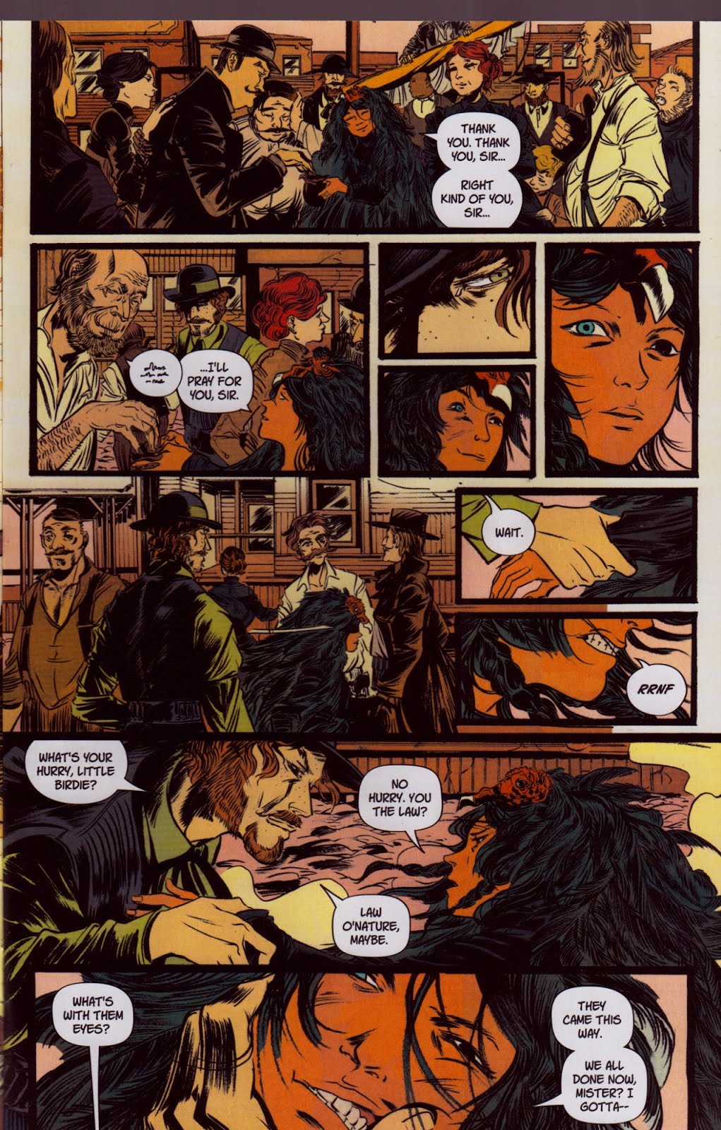
One of the more notable elements with Pretty Deadly’s caged motif is it’s use of familiars. With a familiar, there is a kind of soul exchange that has happened to bond a particular animal to yourself(and vice versa). A part of you is trapped within the animal, and a part of the animal is trapped within you. You are chained together. And because of this relationship the human takes on characteristics of the animal, and the animal takes on characteristics of the human. In the exterior frame of PR we have a conversation taking place between a bunny and a butterfly, both which have taken on human qualities, and both which seem to relate a relationship of identity with the girl who kills the bunny on the second page. Bunny describes meeting her as like “the bud about to blossom fears the sun”–which is important to note, because the blossom may fear the sun initially, but it is the sun which gives it life–this is juxtaposed against the fact that the girl has just given the bunny death–but considering the cover image is of Ginny Deathface at a lake with the skeleton of a bunny whose face is skull is half blown off–one can see this as a binding act. Part of the girl has animated the bunny, and this is what allows it the human characteristics to speak with “Butterfly”. We see a micro-version of this at work with the lizard and Foxy, later in the first issue:
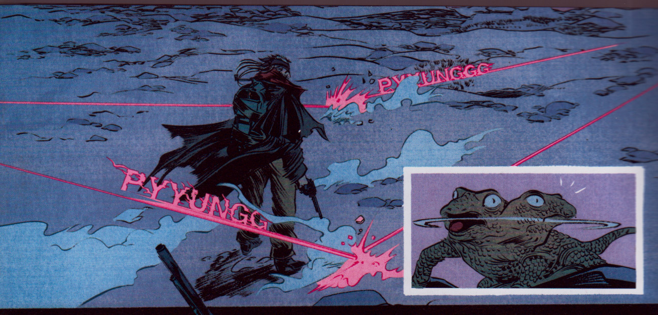
Notice the animation of the lizard in this panel. Foxy is being shot at by unseen gunmen that he is trying to locate. And the way Rios has positioned him, still and with his head slightly turned–indicates some kind of supernatural ability is at play–particularly when the panel right next to Foxy is of the Lizard looking somewhat human, scrambling his vision in all directions, trying to locate the shooters. Also note how it seems as though Foxy has displaced his sense of threat and panic into the lizard–his calmness is played against the panic of the lizard–it is as if he has left his body and taken up possession of the lizard–as he himself takes upon the cold blooded nature of the lizard. There is an exchange here. And importantly the lizard is drawn here within the cage of one of Rios’ panel boxes. As if he has become trapped by both the old man, and our experience as readers.

Once the threat abates, the way Rios’ has drawn the lizard shifts, and he goes back to looking like a normal lizard. Foxy has left the lizard, and the lizard has left Foxy–so the lizard is allowed to leave the book, and it scrambles out of the page. Because it has let go of Foxy’s trauma it is no longer a prisoner of Pretty Deadly and returns back to the wider world which we can’t fully see as readers. The lizard leaves, but the cage remains.
There is a double play going on here with all of this of course, because another version of the familiar, within the larger genre of spirit animals, is the totem–and one of the core strengths of Rios’ as an artist is her ability to handle multi-layered montages across the comic page–montages that, not coincidentally are like totems in design. This goes beyond the simple dramatic effect of cutting away to animals in periods of human drama that you would see in mostly eastern comics(for me, most notably in the work of Taiyo Matsumoto). This is a further entrenching of that device within the fabric of the story’s construction itself.
This type of interplay between story and form extends even to Clayton Cowles lettering choices, which lean heavily into these tiny constricted boxes for the prose sections of Deconnick’s script. This has the double effect of making the prose sparse in terms of the space it takes up on the page as a whole, and the effect of bunching up Deconnick’s words–cinching them tightly into these tiny squares.
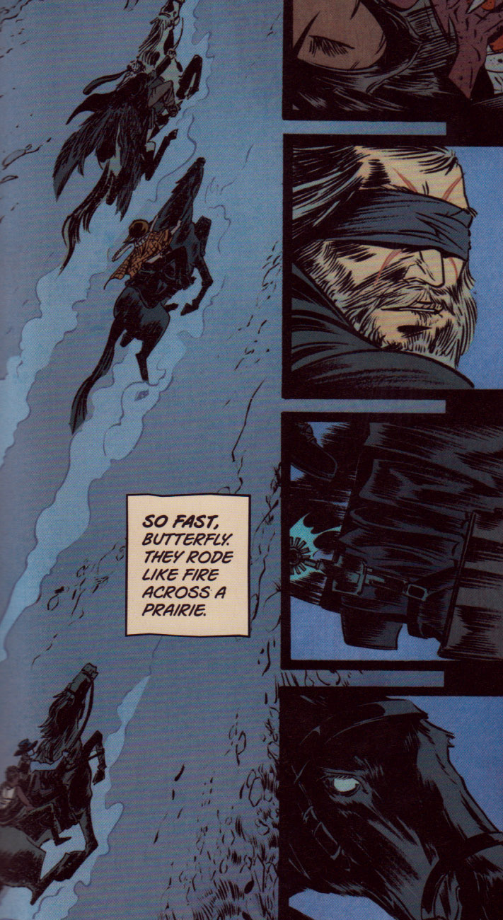
This is a good example of what I’m talking about, and probably the most notable. This box for “so fast…” has this claustrophobic feel to it, as if Deconnick had to trim words just to fit it there. It isn’t “like a fire”. It isn’t across “the” prairie. It’s not “fire across the shadowed prairie”–the way it’s written, and the way it’s lettered feels very pulled back, like on a number of letters in the box kind of way. One of the interesting tensions that Deconnick has to tightrope to work within the western genre of writing is that on the one hand, the west is supposed to be this untapped potential of neverending horizon and colorful adventure–western literature pulls elements from southern literature in that you often get these almost cornocopia type descriptions of space that defines southern literature–but rather than being about the plentifulness of nature without end(southern literature arguably got it in the writings of Captain John Smith with the Jamestown colony, where he was trying to put into words the fullness and wildness of early American nature), the western genre is about the wide open spaces, the wide open unfilled areas, the wildness of the void–so you get, like in Cormac McCarthy’s work, pages upon pages of writing on a particular tumblewheed, or a particular moment of how the sun hits the desert. All of this is married to the notion that life in the west was brutal. Life wasn’t so much cheap as it was short. So there is also a terseness in western writing, particularly in its dialog, but even extending to its descriptions–which may be full, but are typically written in a kind of bullet point cataloging way. Modern western comics tend to hang their hat fully on the latter element of terseness, while ignoring the former element of the beauty of prose. An example of this would be Garth Ennis and Steve Dillon’s work on the Preacher, which completely drops prose in favor of just focusing on the dialog. The notion being that the visuals are the prose. Which I understand on one level. But it’s not entirely true. Writing beautiful spare dialog is a different toolkit than writing beautiful prose descriptions, and removing the latter simply because of the visual aspect of comics is a false step I think. Comics aren’t movies. They are still a medium that you read, and part of that show IS a beautiful turn of phrase. But it is difficult.
Deconnick essentially goes for broke in Pretty Deadly. Not only is there prose descriptions, but there are also songs and poems. There is a tension in all of that, to balance it within the confines of the genre, and the strengths of the medium, and I think Cowles lettering reflects the strain of that balance. You wanna see some shit, notice that the justification on the lettering for the sections of the script that comes from the exterior frame, is different than the justification on the lettering that happens in the interior narrative and is spoken by the characters from within the interior narrative. That changes how you read. Changes something from looking like a poem, to looking like a line in a comic.
In the backmatter section of Pretty Deadly, Deconnick says of Rios’ collaboration with her “I realized that Emma surrendered first. She decided years ago to take the ride with her hands over her head, screaming, and I see that glee reflected on her pages; her lines a tense flirtation between passion and control.” What Deconnick has just described is a ride. What is important to note about a ride though, is that to be on a ride, means that you are a passenger, you are trapped within that experience, and your liberty is not yours to control. The ride is over when someone else decides. You can exit the ride when the worker comes over and unlocks your seat, and they say you’re allowed to leave. The joy of the ride is also the hysteria of that abdication of control. It is the mania, however small, of imprisonment. A ride is another kind of cage. Cages of Pretty Deadly and we’re all cellmates down here.