Guy Peellaert’s Usage of Green and White in The Adventures of Jodelle
It has taken me longer than it should have to write up thoughts on this fantastic fantagraphics release. Especially considering a few years back when the book was first announced, it pretty much sent me into some sort of snake poison hosanna filled fit of happy. I first came across Peelaert’s work probably like…2007 or maybe even earlier. I came across it through some internet search which hit me straight into his Pravda comics–which even in the fractured nature of things found on the internet–still blew apart my whole world. So when Fantagraphics said they were putting this out–yeah. And when I finally got it in my cold dead hands–yeah. Yeah.
This book ended up coming out at pretty much the perfect time for me artistically. I am working on a comic that is hugely indebted to Jean Rollin and Nicholas Devil’s Saga De Xam which came from the same Eric Losfeld led movement in comics that Jodelle came from. There’s a continuum in comics of which Jodelle is a part that is pretty much like the left side of my body. You go Barbarella to Jodelle/Pravda to Saga De Xam/Kris Kool, Druillet jumps in six degrees off of the Rollin and Losfeld connection–he leaves Losfeld and with Moebius helps to start Metal Hurlant and then Job begat Moses begat Mary begat 7 begat 8, and I make my comics the way I make them in part because of all of that.
The plot of Jodelle, such that it matters, is Sylvie Vartan(Peellaert liked putting french pop stars(Francoise Hardy in Pravda) in comics like Marvel likes putting Sam Jackson in theirs(my next comic is just going to be Amanda Bynes face on everything)) is a spy in this crazy Brave New World Roman Empire of strange liquids, sex, and political intrigue. The Preconsuless is basically like if Beyonce was running half the country as part of a separation agreement with Jay-Z, but then like wanted it all. And then Amanda Waller is all “Sylvie Vartan, you need to go find some shit about shit, so when shit hits, it’s not the fans, and we’ve got our umbrellas out anyways”–and then Sylvie Vartan gets amnesia and becomes a weird minor pimp with an army of nuns…anyways…it was the 60s, people did less serious drugs back then.
That stuff is the contribution of one Pierre Bartier, who if this book was released in 2013 would be the only name you’d care about. This would be Pierre Bartier’s Adventures of Jodelle, and you’d fill my comments section with hopeful prayers that he’d take over your favorite Batman crossover book. Which who are we kidding with that one–on multiple counts?
For the longest time this stuff just existed to me on the power of it’s image anyways. My french is at best a repressed nightmare of things I tried to forget from middle school. I was young and foolish then. I didn’t know that if I had paid more attention to french class I could have been importing my favorite comics left and right, and not having to rely on Saints like Kim Thompson to do the work for me. Which as an aside, Kim Thompson’s health problems should scare the crap out of you if you like to read cool comics in english. Because as far as I can tell, he’s the only reason we have half a shot at getting good comics like this. No one else out there is marrying multi-lingual aptitude with dope comic taste and comic publishing klout. If he goes, we might as well all just do a kickstarter for rosetta stone, because none of that shit is coming over in English.
So Guy Peellaert. Let’s talk Guy Peellaert and The Adventures of Jodelle. Lets talk about placing your colors like Chow Yun-Fat places shots in the Killer. Let’s talk about black as a color. Let’s talk about white as a color. Let’s talk about how gradients like annoying people talk about autotunes in hiphop. Let’s talk about fluorescence, which as I understand it is the moment when color weaponizes itself and blows up your eyeballs. This is all the essence of why Guy Peellaert in the 60s on Jodelle and Pravda is hotter than twelve clones of your mama on a sunday at noon.
Peellaert isn’t so much the process of “I need to use this color to get to that color” so much as “if I put this color next to that color, the neighbors are going to call the cops”. His usage of the color pink in that era is it’s own kind of brave. Electric fiery flaming pinks rake across the pages occasionally like lightning bolts from a Miami-based God, a Miami Based-God. But that’s nothing now. Pink is like the third wheel of comics these days. I don’t know when that started exactly–but now if you’re book doesn’t have some pink in it’s colors, it’s like showing up to a casual get together in board shorts or something. No, what is still relevant and still revelatory about Peellaert is his usage of green and white.
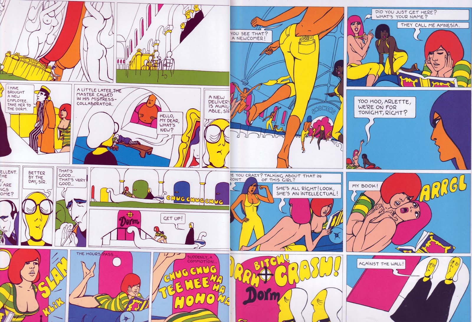
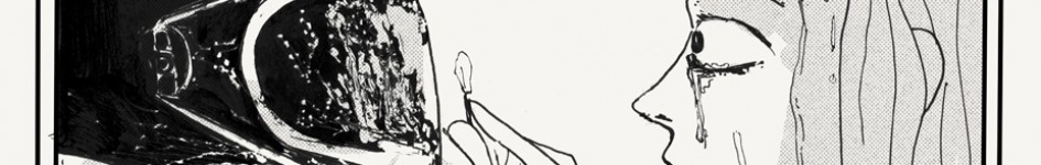
Starting with the white. We’re not talking like how Little Thunder uses white, but what we really mean is she uses this beautiful eggshell color of white that is like that warm cuddly feeling you feel when that little bear from the fabric softener commercials hugs the pillsbury doughboy–we’re talking white as a statement, punch in the face–white as a color that makes you miss the safe confines of electric hot pink. These two pages–I could have picked any page from Pravda or Jodelle–white is Guy Peellaert’s new black. It is the linchpin on which every other punch lands. Look at how on the third panel of the left page there where on a white background, he has a character with white flesh. And a woman with white hair. White glasses on a white background. Both of those choices allow other things to happen. Because of the white hair, the yellow skin pops more–because of the white skin–the blue eye shadow amplifies. But more than that–the predominance of white allows for Peellaert, even with a very simple and clean line to create elaborate depth and architectural elements. Look at how those pink windows create depth in the second panel on the left page. Check those two horizontal panels on the left page with the white gondola motoring across a green river across a white backdrop where like traffic lights the passing windows roll by. And then the cool depth you get with that pink door, the white surroundings, and Jodelle and the Auntie character being the only other colored elements on the page. It’s not something you see much of these days.
There is a bravery in this. A trusting of the line art, and the few color choices you are making. Putting that much white down is the equivalent of Guy Peellaert standing naked in your living room like “are we going to do this, or what?”–there is I think an insecurity in modern coloring where they feel they need to cover their choices up in gradients–or that the entirety of the page needs to have some color on it somewhere–because if not–the world ends, it’s game over, and you’re just another homeless deposed emperor mumbling into nearby sludge about the horrors of editorial oversight.

This bravado in color I think hits an apex here where black becomes white, white becomes black–I mean we are accustomed to black as the color of ink–not as the color of a color. Most of the time when you see a colorist rock a black in a comic it’s not actually black. It’s a dark purple. Or something in that direction of not blackness. This is black. This is “fuck it, draw the thing in white out” black–and then what’s more he still comes back in with white as a color AND a line. And then the green.

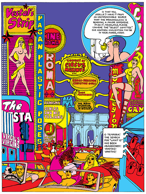
Peellaert’s almost dogged insistence on using the color green could be the most fascinating thing about all of his comics to me. This supersonic hunter green is a color you almost never see in polite company in comics. Let alone this rabid attempt to use it with other colors like “ho hum, don’t mind me”. I won’t lie–I think it’s abhorrent. But it is something I can’t look away from. It’s like how when I was a kid I couldn’t watch horror movies because I would have nightmares for months–and then when I got older that discomfort made horror addicting to me. Peellaert’s green makes me uncomfortable. It should make you uncomfortable. And that makes it interesting. Call me when Suehiro Maruo is rocking out to green on his work, and then I’ll see you at the puke barn. Other comics in this time period also used this green to some of the same effect. There are pages in Caza’s Kris Kool has some really ugly green and grey pages in it. But I feel like it’s more of a tick in Peellaert’s thing. I’m guessing that it is something that came over from Forest’s Barbarella. Or there was some french color Illuminati situation, and using green like this is like throwing up the bat signal in terms of secret handshake situations. It’s like clap three times, and a tulpa of Andy Warhol comes and makes you a nice pie or something. But I can’t look away. There is something to it. Thirty car pile up shit. And if you shut your left eye and just think about it in terms of Jodelle’s costume, it’s pretty “yeah I’d dress like that too if I was in a biker spy gang too”.
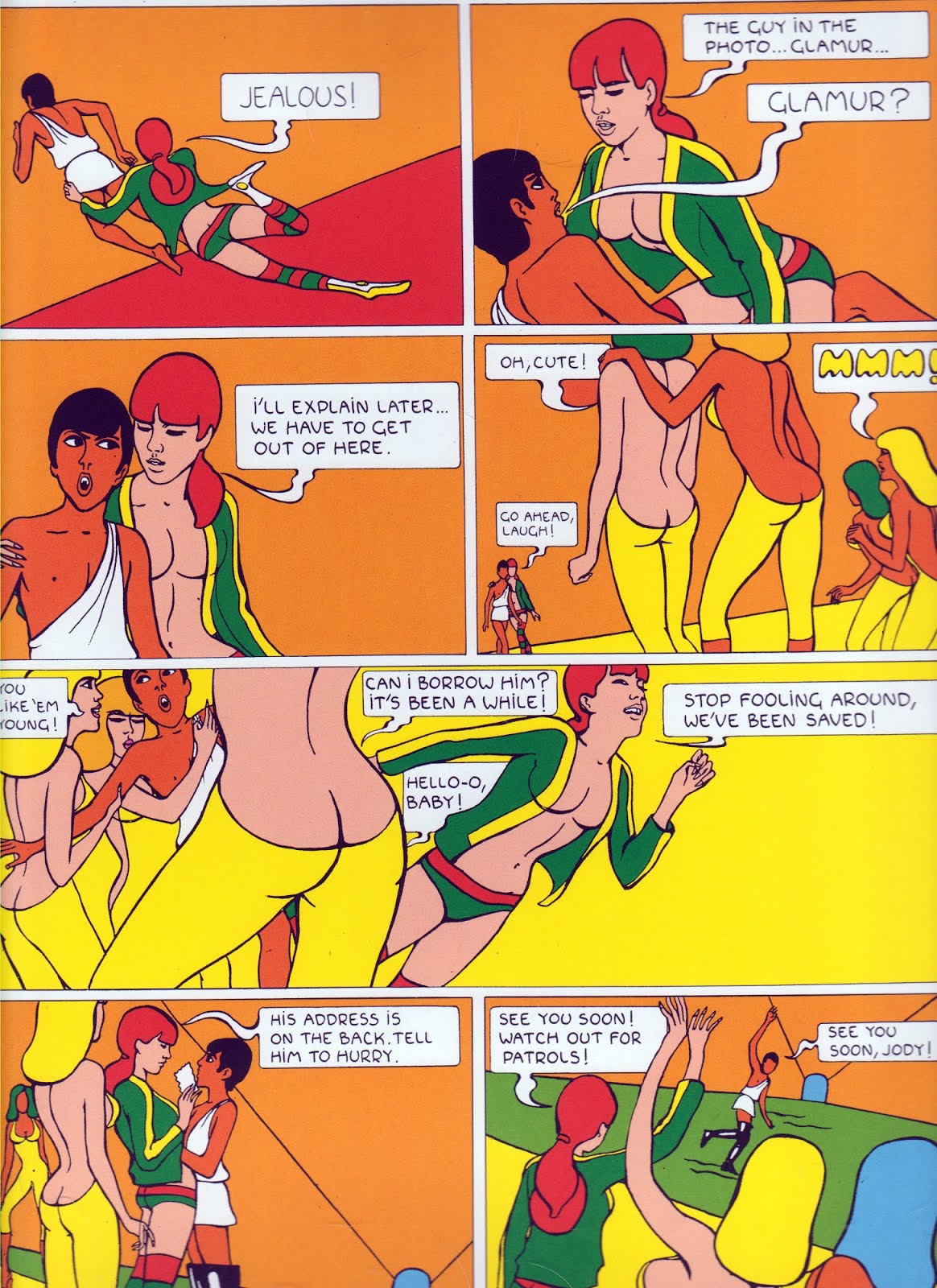
Now for the most part, like I said before, Peellaert isn’t really about color progressions between panels, so much as color juxtapositions–red panel, next to blue panel, next to green panel–and sort of the jarring effect that produces. But there are some lovely progressions that Peellaert does go through. Look on this page how we get that red horizontal leading up to Jodelle’s red hair in the second panel. The third panel sits almost as an aside from the L of yellow that we get in the fourth and fifth panels. The way the girls yellow pants and the now yellow ground gives way to a completely yellow panel background is beautiful. And then we jam back to the orange before the last panel which sort of has all of the colors in equal measure.
The reason a lot of this really works well is because Peellaert’s line is both clean and expressive. Figures elongate and contract as the moment fits. Architectural elements are at once simplistic and concise as they are extravagant and baroque. He creates the space for color to express itself. Sometimes it is important for color in a comic to serve more as a bassist and just form the rhythm over which the lineart can solo/steal the show. Other times, like here in Jodelle, the color is the thing–and the lineart is just about creating the space for you to hear that bass line. Comics like this, you need a big page– a big sound system–and you roll down the street and everything thumps, and the world is better for you in it. That’s this kind of comic.
And while a lot of these images are a little dulled, and cropped weird because the book is too big for my scanner, and my scanning game in general is weak–it is worth pointing out that to see these in the huge coffee table size that Fantagraphics has produced this book in–is to to be children of a greater god. These are pages you luxuriate over while sitting in a warm bath. You let a comic like this basically bake the inside of your brain, and you consider how inadequate your life choices have been to this point. To make matters worse, besides the core Jodelle comic, there is a heft of extra images from the rest of Peellaert’s career.
I am particularly interested in seeing more from these later period of Peellaert comics where he sort of returned to comics all prodigal son like, and made these weird collage pop art comic pieces–because…yeah…look at that stuff.


I found “The Adventures of Jodelle” in a bookstore a month ago, and couldn’t explain my fascination for art so strange. You’ve done a fantastic job at it. I hadn’t isolated color’s role: color as depth, as narrative device, as assault.
This is a rich, intoxicating review. I know I’m going to end up buying this book and swimming into it.
Pingback: A Guide To My Writing for 2013 w/ Commentary | 73
Pingback: Skelly Rising: The Power Chord Spaces of Katie Skelly’s Operation Margarine | 73