Rob Liefeld/X-Force Comics Love-In Part III of III: Decoration in Comics

“I also think you can see another thing in my work–something that Klimt was approaching–that abstract art is everywhere, and we call it decoration.”
~Zach Smith, “One Thousand Choices per Minute: An Interview with Zak Smith Conducted by Shamim M . Momim” from his artbook Pictures of Girls
It was kind of a nice bit of coincidence that in the week interval between the second part of this Liefeld series, and the final third part I got Zak Smith’s fantastic artbook Pictures of Girls in the mail–and he happened to in an interview that was included in the book, bring up the issue that I was wanting to talk about with Liefeld’s X-Force comics. And that is the function of decoration in art. Or for my purposes the function of decoration in comics.
I think I would define decoration as I am talking about it as something which is ancillary to the core image, and is at once abstract and impressionistic. It is a pattern or color or shape that doesn’t need to be on the page, but exists there as a function of the artist’s individual expression–whether that is an externalization of an internal force, or the internal characterization of an external force–decoration creates mood and shape, and tone–it’s one thing to just wear a nice dress–it’s another if you also rock out the accessories that make it a complete look/a complete expression of your individuality.
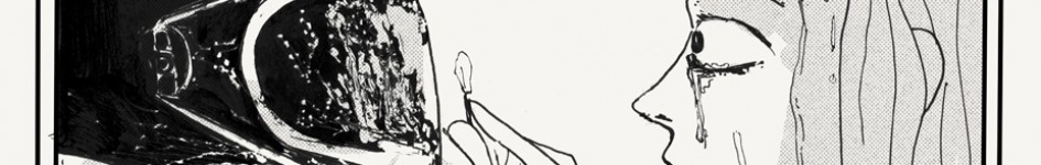
In comics this is very interesting to me, because I am very interested in making almost personally encoded comic tapestries with my work. I think because as a function of growing up LGBT in a very religious environment–even subtle expression speaks very loudly to me, and loud expression is almost a form of protest. To take it another direction, take when Kanye caused a big uproar when he rocked that skirt. I think on the surface that was an uncomfortable transgression of gender norms for the average person seeing it–but the actual message had more to do with Kanye’s presentation as himself as a coded idea. It was unnecessary decoration, sure–but it was part of the whole too. And maybe that’s the borderlands where you start wading in from decoration to core elements of image. But I think that fuzziness is important, and is itself an aspect of the role decoration plays. When you look at the top Klimt image–the background is decoration–that much is obvious–but the characters themselves are made up of decoration as well–which shows the degree to which that kind of thing intermingles and blurs.
So that brings me to Rob Liefeld and his X-Force Comics–which have as one of their more intriguing and interesting aspects, a propensity for extraneous decoration in place of traditional symbol placeholders for space and thing. It is one of the things that makes those books absolutely pop–and I think is one of the things that made them have such a huge impact on me as a kid–and it’s definitely something that when I come back to it now, after being exposed to more art–that stands as one of the core things about this early Liefeld work that makes it still important for me.
The Rob Liefeld/X-Force Love-In Part III: Decoration
Part I | Part II
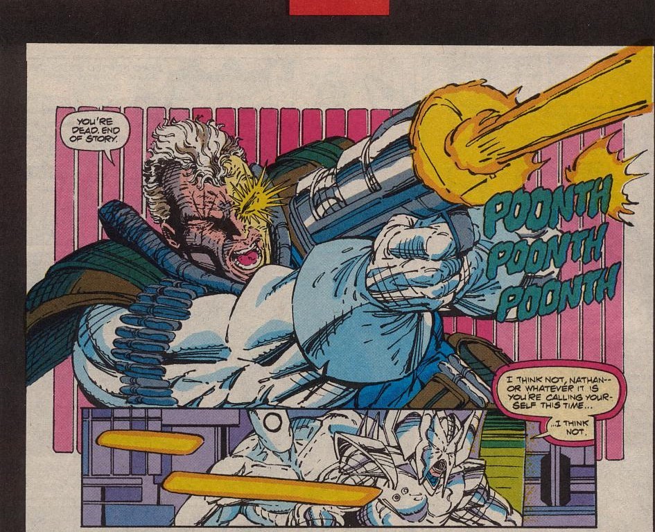
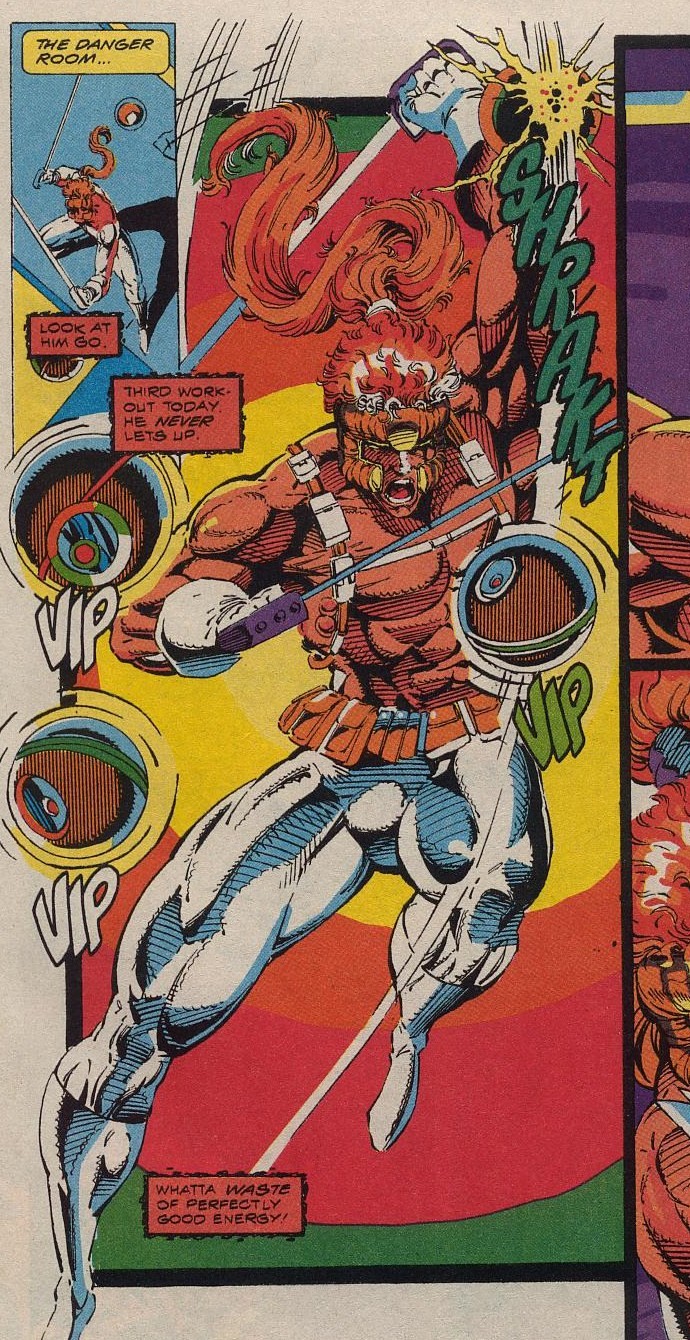
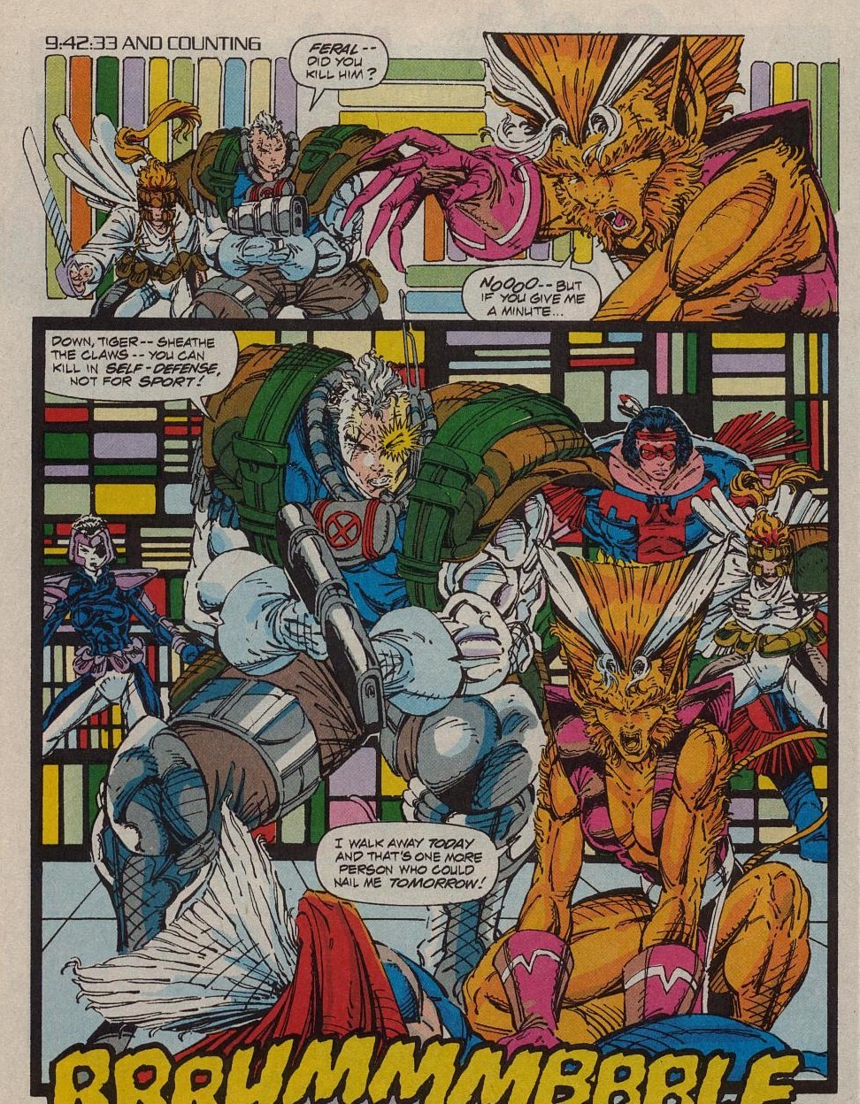
This is the kind of thing I am talking about when I talk about Rob Liefeld and decoration. Notice the vertical rectangles behind Cable on the upper panel, and then the rectangles and lines behind Stryfe in the panel below. Now what most artists do in this situation is they either leave that space behind cable blank–or they put in a panel, and add a background that denotes space and place on the page in the story. So you know from where in the room Cable is firing his shots. And then they would also in the lower panel try and maintain a consistency of that space so you can as a reader maintain your sense of space. But what we see here is that that’s actually unnecessary. Liefeld has exchanged the realistic background behind Cable for this impressionistic set of shapes–which add dynamism to the image–as a reader all of the visual complexity is foregrounded–usually in the presence of a complex background, what you’d see is a need for grey tones, or for the colorist to sort of color all of the people and buildings a darker shade–and you’d get your separation that way. But the simpler complexity of the first panel with cable allows for the image to have more OOMPH. There’s also a subtle directionality implied in the coloring of that background pattern which creates an almost strobing effect to the right of the page where the laser fire is situated.
This is rather liberating to understand in comics I think–because it is a level where individuality and expression can sort of find space where it’s both allowing for a dynamic foregrounding of the core figure action, AND allowing for personal decoration on the page. It is fundamentally the same way that speed lines work–but y’know…kind of less played out–and more inviting of variant expression. Now, unfortunately Liefeld never goes completely insane with his patterns on X-force. You would have liked to have seen him go the next step and just go wild styles on every page with different patterns and textures–but for what it’s worth–I think his repetition of in particular the vertical rectangles in x-force allow for a certain rhythm to build–and there is a stronger visual coherence for that choice. Though I would also argue that visual coherence doesn’t play to Liefeld’s strengths in X-force–and that if the book had followed it’s own logical progressions it would have been like the back post 808s Kanye–which would have been a comic of such excesses and swagger that it would have literally cracked your brain in half. With a wrap around hologram cover no less.
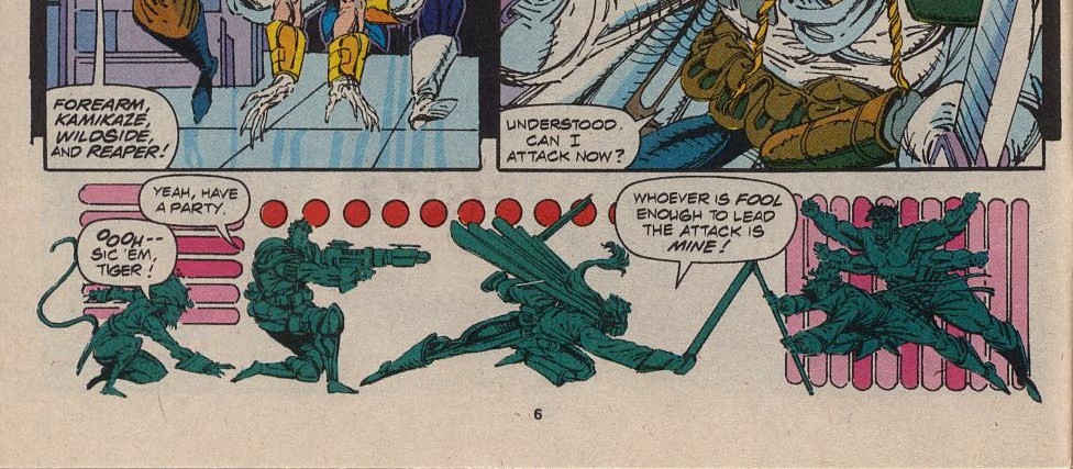
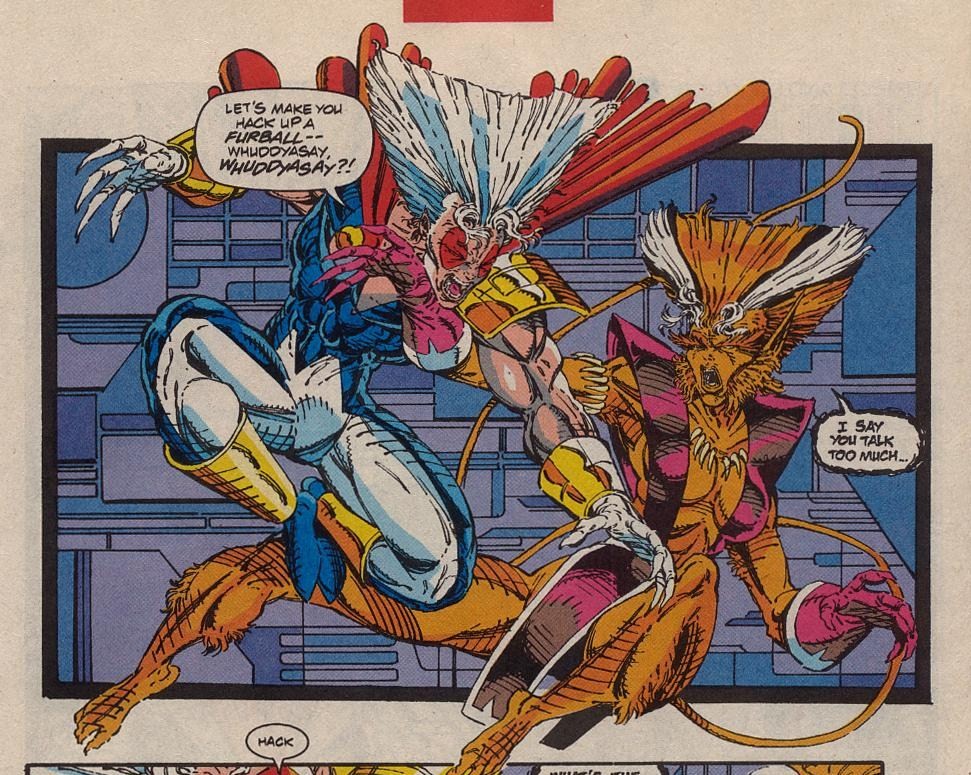
In this bottom panel we actually see some of the ostentation and experimentalism that was seeping into this book–and really, you’d have to go back to some of Frank Miller’s Ronin pages to find the next American equivalent in comics to that point. But I think it’s interesting how just using some simple circles and rectangles Liefeld is able to create movement and dynamism on this panel which far exceeds the pages where he drew actual legit backgrounds. Look at the way the horizontal rectangles suggest the movement from Rahyne to Cable to the dots which almost rush Shatterstar headlong across the page to an enemy that is held stationary on the page–almost imprisoned in front of the vertical bars. I mean it’s a total “where were you when you were 8?” kind of moment.
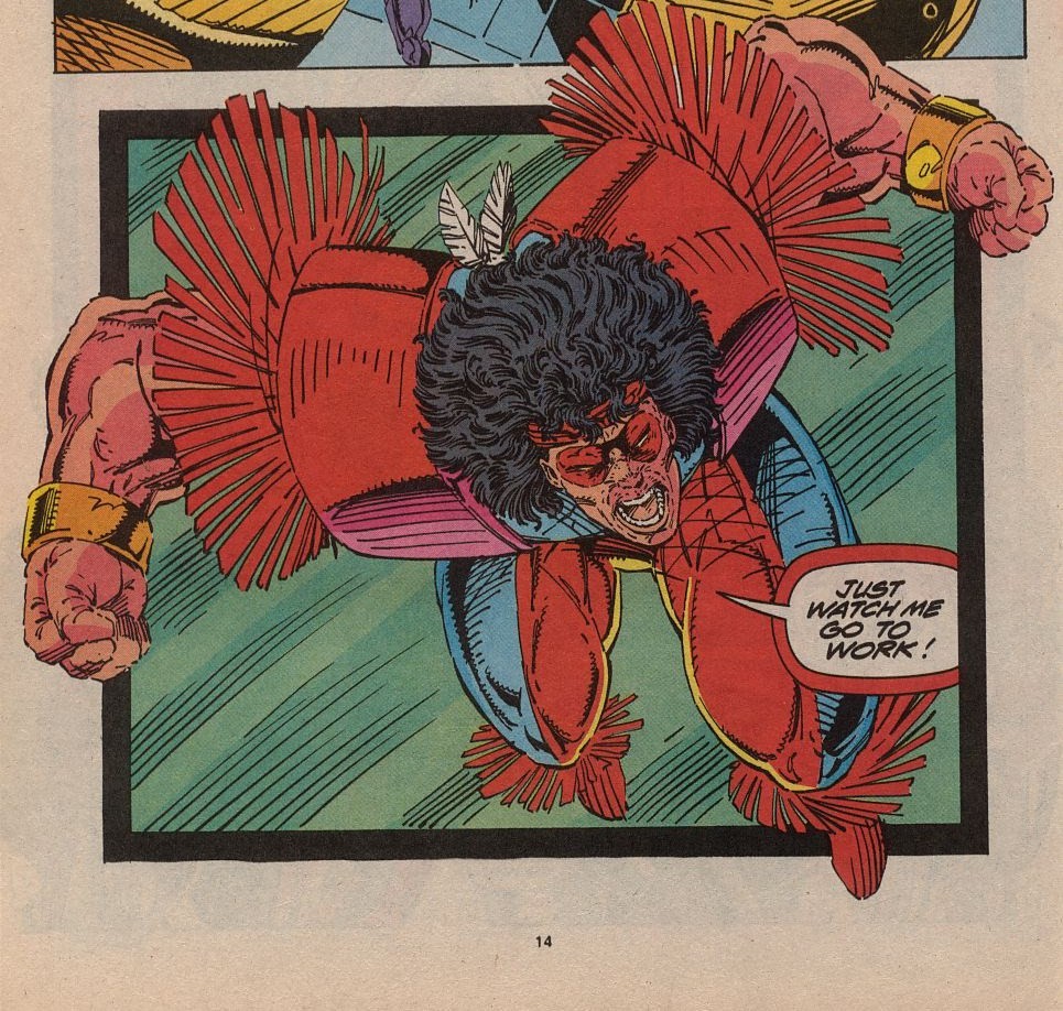
It wasn’t always just vertical rectangles either. Look at this page with shatterstar. The top left panel gets this nice diagonal movement with that triangle yellow arrow pointing you into the page–and then there is this trippy bullseye behind Shatterstar that particularly because of the way the colorist colored it–almost vibrates the page. Would this page have been stronger with a standard issue Danger Room type background there instead? Yeah that would have been harder to draw–but visually this pattern is both extraneous and integral to the image. It doubles as a characterization of Shatterstar’s focus and fury.
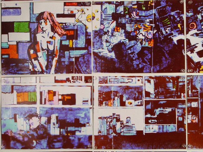
You actually see this kind of thing in a lot of Brendan McCarthy’s work. This image is I think analogous in function to what Mcarthy is doing with pattern on this Zaucer of Zilk page:
Again, you are seeing the power of a characterizing decorative background behind more complex foregrounded elements. It’s actually the same visual reason why really complex realistic backgrounds with cartoony figures in the foreground work as well. That tension between background/foreground complexity is something that works very well in comics–and I think directly plays with the animative qualities of the medium.
Another interesting aspect of these kind of panels in X-Force is the ones like this–where it is a hard thick outlined panel/pattern–behind some dynamic action sort of happening in front of that panel–or twisting insanely through it(as an aside–I wouldn’t mind seeing the fat chunky panel border make a come back–reading a lot of these older comics where that was in vogue–it was a pretty effective technique–particularly if you wanted to move panels around in weird arrangements). They almost look like abstract paintings on a museum wall and there’s kind of a fun pop art attack going on there that it’s hard to really even guess at an intention in that direction–but it’s fun to think about regardless. I like to think these X-Force issues basically happened in art gallery–and the hilarious juxtapositions that creates.
But yeah, these comics are that kind of fun. And I don’t mean that in a hipster ironic “yeah these comics are cool” kind of way. I mean genuinely that these comics are still fun to go through–and they remain interesting to me. Like I said originally–these were some of my first comics as a kid–they had power for me then. They still have power for me now, but it is interesting and useful for me to come back around on work like this and try and tease out the elements that still work for me. I feel bad for people who just dismiss any comic Liefeld did out of hand, simply because of a dedicated internet meme. The fact of the matter is that, I don’t believe many are being truly honest in their disdain for Liefeld on a purely comic reason. This man sold far too many comics for me to believe that all of these people have always hated his stuff. There just mathematically has to be a portion of that that are people who are just following a meme because it’s not cool to like Liefeld. I mean you can go through the comment sections on just the three articles I wrote–and there are people who came in for no other reason than to just chuck in that Liefeld is a shit artist. There’s all kinds of terrible artists out there that the internet hasn’t devoted itself to shitting on everyday. I’m bringing this up because a percentage of the hate–since it’s just people following a trend–you’re going to come back to this stuff. The comics are too good not to.
The 90s are basically back already–it is only a matter of time before you start seeing more and more people openly contesting the outrage. Eventually it will be cool to like some of LIefeld’s stuff again. So you might as well save yourself the trouble and come over now. This is a mission of mercy. Mitch and Maury and all that.
Because your case–that anatomy built sandcastle you’ve been blasting everyone with? It ain’t shit. Charlie Brown has bad anatomy. Anatomy ain’t comics. You judge the image unto itself–or within the greater work. What part of what Liefeld is doing on these pages says to you “here is an artist who is asking me to evaluate them against the standard of anatomical realism?”–and what’s worse is that your shitty anti-Liefeld case has created an era of boring ass American comics obsessed with realistic character dimensions in action comics. It’s the same idiotic line of thinking that says because Guillem March drew Catwoman contorted in an impossible way to show her T/A–that that must mean that March is a shit artist and can’t draw. Do I think a foundation in anatomy is important for any artist? Of course. But at the end of the day–it is INCONSEQUENTIAL. You don’t need realistic anatomy. You don’t need photoreference perfect buildings. You don’t need rules about perspective–or in dialog this character has to face this way or that way–all of those things are guideposts to help our visual language–but every single thing can be broken and still produce a comic that can shake readership to the core. These X-Force books and Liefeld’s later work were some of the more popular works of the modern era. You can not take that away from him. And you have to ask yourself–if these books were that popular despite being shitty across all of these made up rubrics you’ve made for judging good art vs. bad art–maybe it’s not that Liefeld is a shitty artist? Maybe it’s that your rubric for how you evaluate art in comics is unnecessarily restrictive and imposing?
Why do I care though right? I mean I care in the sense that writing about this shit helps me organize my own thoughts, and processes for my own comics–which are waaaay worse drawn than any of Liefeld’s comics. Me going through these is my way of trying to understand why these comics had power over me, and then seeing what I can learn as a still-growing artist. And there are lessons in these books. For everyone in the industry. There are absolutely things that I’ve highlighted in these articles that would 100 percent make current superhero fair more dynamic to read. Ignore at your peril.
Liefeld also resonates with me because for the most part he got over on style-swag. And right now the only thing propping me up in my own comics is that what I do–no one else is doing. My stuff looks like my stuff. Even if it’s fucked up and broken. So it is interesting for me to see the ways in which Liefeld dealt with similar problems of being so style slanted–while being in the public eye. Obviously my goal is to be less hinged upon my style–because basically what happened to liefeld is that eventually his style went out of style–and he got sort of stuck in that early phase of what he was doing. I mean by that point, he had made more money off just comics than anyone working today could even hope. But you see this early Liefeld stuff–and it would have been cool if he had kept pushing. There is an antagonistic side to his art–and if anything, the problem was that he kind of caved to critics who wanted him to move more toward a Jim Lee type of hustle–I would imagine because the attacks were always so viciously targeted at his right to be an artist–it would have been more interesting if he had been sort of proto-Kanye–and just said fuck it–and just gotten weirder and weirder. And say–you’re either a part of the ride or you’re not.
But I think we do get a nice snapshot here in his early work of some threads that still are crackling in their electric resonance. So whatever. I don’t feel bad for anyone really.

That’s Feral not Rahne but great series of examinations of Rob’ s art, very spot on with what I’ve been saying for 15 years now. When Rob did try to get more with the swing instead of his own thing, people blasted it in spite of it looking and reading better than most of what is out there. If you compare his Captain America run toto most of what Marvel, DC and Image were putting out, it was a lot better than the hackneyed work we had been seeing for a couple of years, since the Image guys left. I actually preferred Rob’ s work on Cap + his occasional pencils on Avengers to the mess that Jim Lee was producing on FF. His layouts were cleaner and more efficient compared to Lee, who tends to suffer from overly busy layouts and static designs. The Awesome Entertainment period was similar. RE:GEX possessed some very dynamic art work with top notch story telling that sadly was crippled by only having two issues come out. The first issue was lacking in backgrounds but in the storytelling you really didn’t need the detailed environments because the panel borders themselves provided the implications of the surroundings. Like a good stage play liefeld’ s art uses minimal props to tell a large amount of detail, using only what is necessary to the story.
Love your articles. VERY INSPIRING! I miss the fun stuff in comics too. It´s all too boring and deadly serious nowadays. Thanks for these three great articles!!!!
Loved these articles, thank you! I thought I was alone being a Liefield apologist, but you actually gave me some art theory weight to put behind my “But his comics are really fun!” argument…
oh Liefeld just didn’t want to draw backgrounds because they’re hard
maybe so, maybe not–who cares? The comic came out beautiful. I wouldn’t mind seeing more background textures and patterns over boringly drawn same old same old. Makes for a more dynamic page.
Pingback: A Guide To My Writing for 2013 w/ Commentary | 73
I wasn’t collecting comics in the 90’s but I loved comic characters (thanks to their animated counterparts) and I remember my older cousin (who was more into cartoons too but bought the odd Marvel/DC comic) showing me a few X-Men comics that he had, and it was like whoa! These are like the cartoons but grittier!
I now pick up a few DC monthly’s and have a fairly good Marvel back issue collection (mostly Uncanny X-Men vol 1).
All that being said… I would kill to have Lee and Liefeld back on X Books. But saying that, I think I would just kill for comics to be more like the 90’s again… and I wasn’t even around comics during the speculator bubble etc. It’s partly nostalgia of seeing the EXTREME style of comics as cooler, gritter, brighter versions of my beloved cartoon characters with years of background as opposed to 25 episodes. But personally, I think they seemed more fantastic when they were EXTREME!!!!!!
I love comics now, don’t get me wrong but the Liefeld days were what comics were about to me. OTT fantastic action stories with FUN art! And Liefeld (and Lee imo) define that.
I personally think that the artistic talent has improved in comics, a significant degree. But that’s almost the problem. It doesn’t feel as much like a comic as the older ones. Sooner or later, it’s going to look like photographs. But I guess that’s all down to personal taste.
Such an intelligent and refreshing rebuttal to the crushing dogmatism and groupthink that inevitably washes over anything nerd culture gets its cheetos stained stranglehold on. Arbitrary rules, guidelines, and a fundamentalist devotion to the current fashion propagated by these insufferably snarky Puritans, never fails to suck the fun and soul out of any art form. The best way to tell if you’re going the right way, is when it’s in the opposite direction of the masses.
Wow, thank you for this- absolutely brilliant, really. And the point about how boring the trend of “realism” (or verisimilitude, really) in mainstream comics is-so true.
Liefeld was one of a small, but sizeable handfull, of artists at the time daring enough to break the mold of the incredibly boring, although anatomically proficient, house styles of the Buscema’ s and Romita sr’ s, etc. Those older styles were far more “realistic” and less challenging to read, but they lacked energy and left no room for experimentation or growth. Sadly, today the trend in action comics is an even more boring realism( made totally lifeless by the poor/over-use of photo-reference and computer color, among other things).
These are terrific posts—thanks!
This series got me thinking about one of my favorite childhood superhero comics runs — Len Kaminski’s Iron Man. The first issue I got was Iron Man 289, which was guest-penciled by the eternally underrated Tom Morgan, whose art is weirdly angular and totally dynamic. The issue feature a battle between War Machine and the Living Laser that’s all power and thrust twisted anatomy and it’s great. But then the next issue saw the return of regular penciler Kevin Hopgood, who’s a perfect good artist, but who’s style is much more realistic and, quite frankly, stiff — and considering the cyberpunk elements that Kaminski was throwing into the stories, an artist like Morgan would’ve been a much more interesting fit.
Eventually, Hopgood left the book, and Morgan took over full time, and my god, the complaints that poured in about Morgan’s “cartoony” art… I felt like I was going crazy, because as much as I enjoyed the issues with Hopgood on pencils, the Morgan issues felt like the potential was finally unleashed. So much more dynamic, fastidious attention to anatomy, etc, be damned.