
Rob Liefeld X-Force Love-In Part II of III: Page Layouts
One of the things I still get a lot out of the old Rob Liefeld X-Force comics I read as a kid is how dynamic his pages were. Particularly the first say 7 issues–which I think are a sort of rock start testament to the efficacy of his approach within the genre. It is actually interesting to look back on these pages now after the things I’ve talked about with Crepax’s page layouts, particularly in his Anita series. Because these Liefeld comics use the same sort of power X-Y axis approach to their most dynamic pages. And really, for probably a lot of the same reasons in terms of their audience.
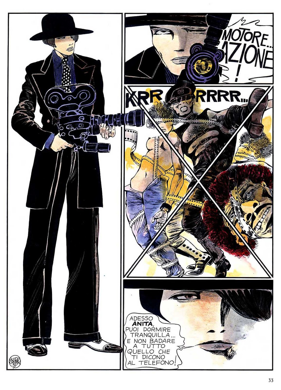
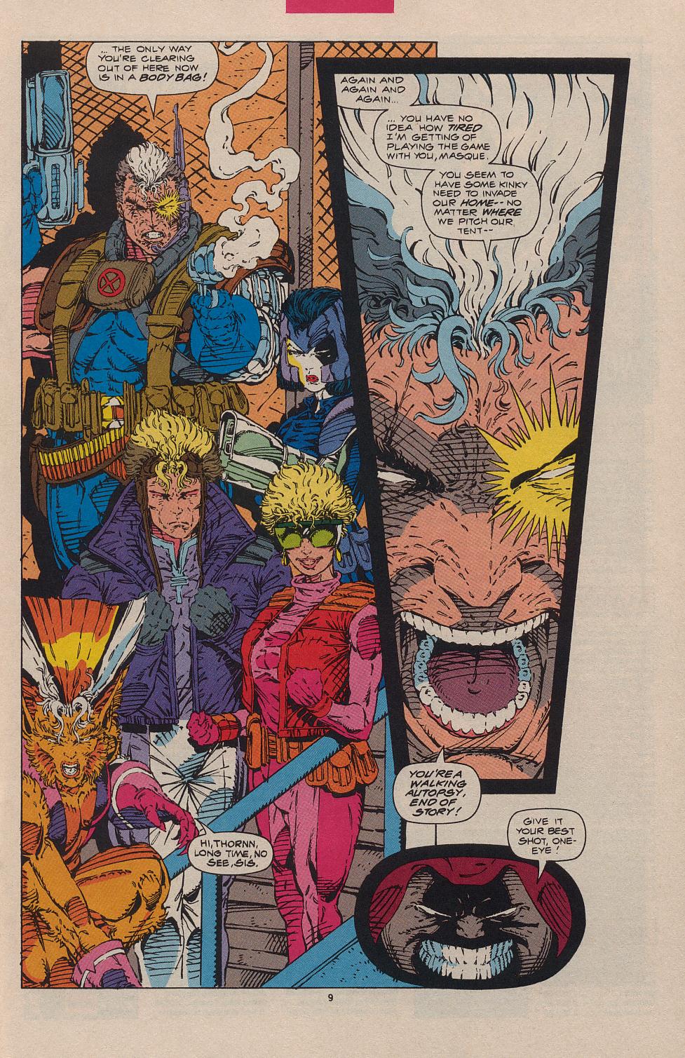
One of the most effective things Liefeld does, and he does it a lot in these early X-Force issues is this sort of power vertical panel on the left side of the page, and then smaller vertical panels sort of falling up or down in parrallel. There’s all kinds of weird motion effects this produces reading them. The above page uses this vertical panel to play into those smaller vertical pink rectangles in the background the second panel–which combined with the coloring produces this fade out effect for this last page. I also dig how the bottom of the second panel is drawn but not the top. The sense of play in these early issues is pretty terrific, and in some respects reminds me of sort of a toned down version of the fun Brandon Graham has with his comics.
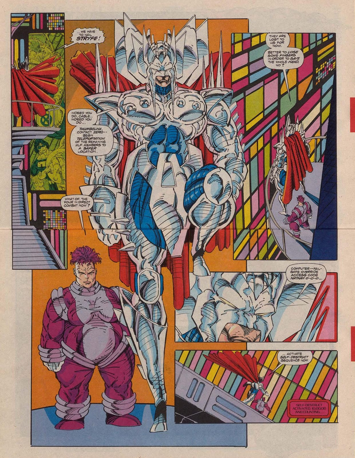
I mean tell me that fun isn’t being had here? This is a two page spread that you have to turn the book sideways to actually read, and Stryfe is actually perching his foot on one of the panels from which he is speaking. And again, notice the use of the vertical panels here. There’s a power in Liefeld’s usage of them. They are like exclamation marks on a page. The composition is actually very much an exclamation mark in shape. The way the far right panel squares of color angle back down toward the center of the page–and go behind Stryfe creates this twisted depth of the panels–because we have stryfe in front of/on the lower panels–but the top right panel actually intersects between Stryfe’s shoulder and cape. That’s freaking crazy. And a lot of fun. I love that kind of thing. Like on a technical level it’s bizarre and wrong–but on another level it’s bravado, experimental, and surreal. And it plays with the flatness of the page and the panels. I think if you saw these comics as they were in Liefeld’s brain–they would almost be these weird hyperdimensional objects that you could move into and out of concurrently. The thing they remind me a lot of is this one page in Blaise Larmee’s tumblr comic:
These early X-force comics presage .gif comics, without actually.
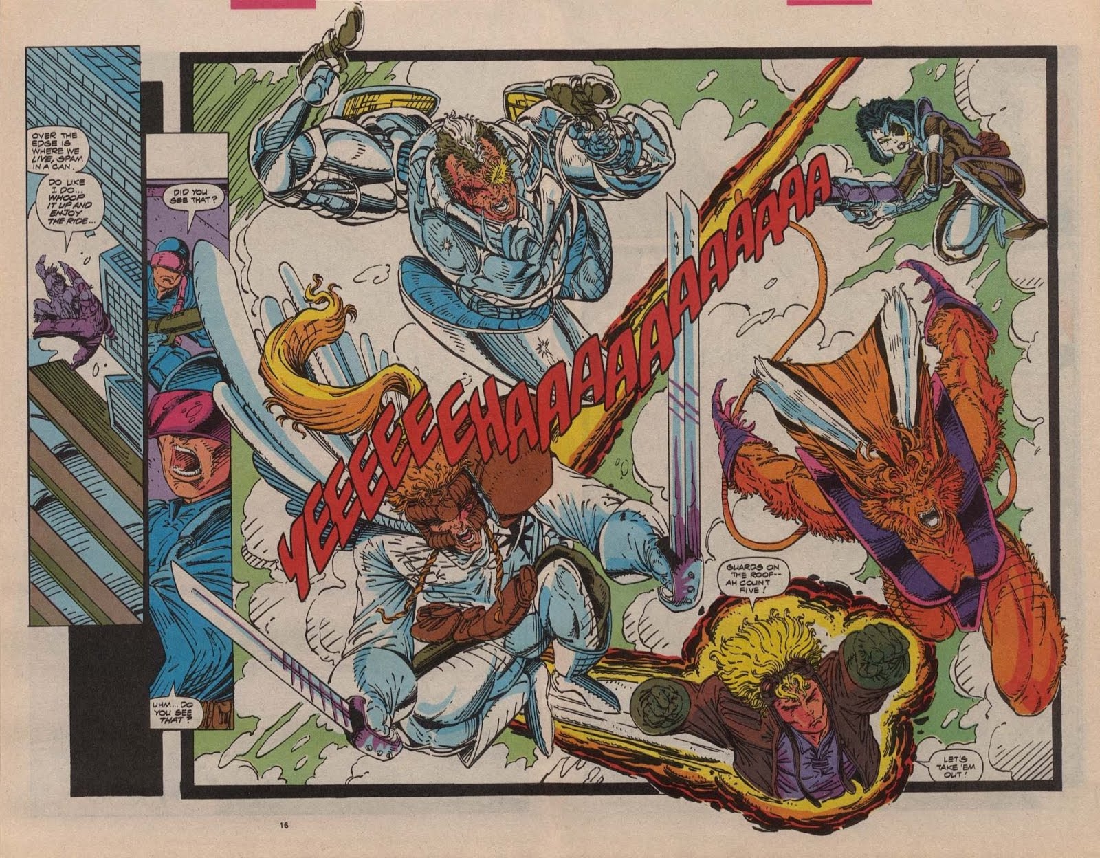
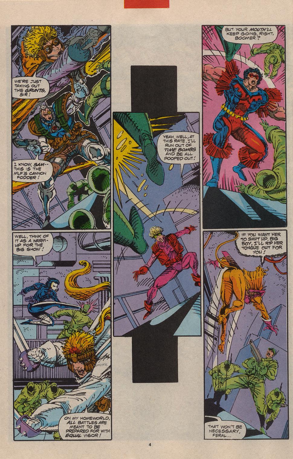
I mean this kind of image is just beautiful. Again we see the vertical panel/exclamation mark setup on one side or the other–but in this kind of layout it’s minimized for this hard square that is again…behind one of the preceding panels–even as the characters are ahead of both panels. Just through how he is placing his panels he is creating depth and dimension and time for his characters to move through. And that hard square line holding in a set pattern that the characters pose over is a whole other kind of dynamic comic making shit that I will get into in the next part of this series. But seriously, you don’t see much of this kind of thing anymore. People ran so hardcore away from Liefeld–but characters popping out of and through panels is something you SHOULD be doing in an action comic. It’s something you routinely see in japanese action comics. But, I think for largely editorial reasons, it’s been excised from western comics to the degree that it should exist. I mean it should exist even more in western comics, given how compressed the action in our comics is. You need the few moments you dedicate to action in these comics to hit hard. They need to bang. Page design like this is the kind of thing you would tear out of the comic and hang on your wall.
Oh and lest you think Liefeld wasn’t at all cognizant of these choices in layout. Yeah. Exclamation marks. This stuff is pure comics.

Wow. I loved Liefeld’s work. Sadly, he’s moved away from this . . . but yeah. Those comics were the ones that got me into comics in the first place. X-force was the best thing out there. My friends were like, no X-men and I was like, NO, X-force is more violent and no holds barred. It appealed to the inner anarchist in me. These comics were brighter and prettier and more violent and fun. And the coloring really has gone boring and sad. Most comic book coloring now a days makes me cry. It all looks so blandly the same. Artists back then at least knew how to draw, and while there are some geniuses today like McGuinness and Capullo . . . a lot of the art is bland and really not stylized or even interesting.
Hopefully this could turn into a thoughtful conversation about Rob’s art and not into a namecalling fest from his diehards who simply cant accept some truths.
Your fawning over Liefeld’s layouts, then you would fall head over heels for Portacio’s during his X-Factor and Uncanny X-Men issues. They’re probably more daring and executed better than Liefeld’s. Most times Rob’s layouts hinder the storytelling, plus add to the fact his limited artistic skills he practically painted himself into a corner by shoehorning the art inside each panel. In a related note to pt 1 of your analysis, the colorist HAD to make some sense of what Rob was trying to convey, no backgrounds, geometrical shapes, whatever, laziness on Robs part made some of those color choices happen, so in a way those are happy accidents. Try and make sense of Rob’s art in black and white, you’ll have no idea where anyone is on any given panel.
Yes, Rob’s work is about fun, what most comics should be about, sometimes people forget that, but dont fall into the category of most Liefeld die hards who turn a blind eye to his awful awful artwork.
I might do part III tonight. Part III IS those no background, geometric shapes–such and such. They are decorative in function, and I am so about that shit.
Pingback: Rob Liefeld/X-Force Comics Love-In Part III of III: Decoration in Comics | 73
no. no. no. no. no. Revisionist attempts aside. Liefield was one of the laziest artists in the field at his time. He was quoted in fanzine articles that his thought process was: “If Byrne [John] could break the 5-6 panel grid to effectively tell a story, he believed he could effectively tell a story in 1-2 panels. Thus giving birth to entire comics consisting of nothing but 20 splash pages. He did this to shave pencil production time – and he still managed to have one of the worst reputations for hitting deadlines through-out the 90’s.
No matter how one tries to re-position this guy, there is 100% validity behind honest criticism of the lack of anatomical knowledge or structure
Anatomically correct comics is a style choice. It is not the law of all comics. Again. Charlie Brown’s head.
Secondly, he was right. You can effectively tell a story in only two panels. Or just entirely in single pages. You do not need to use a single panel to create a great and effective comic. Panels are just a way that an artist breaks up time on the page. There are absolutely beautiful Sergio Toppi pages which have no panels on them but still convey the same sense of the passage of time. I think that these X-Force issues prove Liefeld’s point, assuming that is what he said. Some of the strongest pages only have a few panels in them. That long vertical panel he puts on his pages–sort of his exclamation mark layout style–is highly effective–and that particular positioning is something I’ve talked about a lot with Guido Crepax’s pages. Crepax crams in like 40 panels next to it–but the power of that vertical panel and what it does to the reader in breaking up the page is extremely strong.
I don’t personally care whether Liefeld is lazy or not. His comics, specifically these X-force issues are still hugely powerful comics.
I think it’s important for critical analysis to attempt to reduce the amount of biographical noise, and zone as much in on the text itself as possible. And questions of Liefeld’s work ethic, and whether he could or could not draw anatomy effectively–are immaterial to the appreciation of these particular comics. I don’t see the relevance of those points.
My only problem with Liefeld is that he copies images from other comics, not story telling techniques or styles, but images from other books.
That type of thing doesn’t bother me. Steal everything. Plus I think that kind of focus has nothing to do with the comic medium–which is not defined by a singular image on a panel on a particular page–but rather the sequence of images collected across a book’s totality. So even if every panel was lifted from another source–it would still be it’s own thing.
steal everything, unless it’s Deadpool. Liefeld will fucking kill you if you steal anything HE made
hey, great article! until today i only received bad criticism for ROBs art… and your point of view is new and fresh to me…
but, i have to say that im not with you on this… ROBs art has so many flaws that constntly throws you away from the history and keeps you thoinkin “how the hell can this guy draw THAT bad.. its not a thing of academicism or anatomy… is about expression. You can compare his work with other guy who also didnt has knowledge of anatomy, and made all of the faces the same, and drew strange backgrounds and impossible machinery.. im talking about jack kirby. THAT is quality and expression over academicism. And 40 years later ROB has nothing new to say… just repeat old tricks in a bad way… in perspective, the figure of ROB fades and dissapears.
Sorry bout my english not my native language
Pingback: Jiro Matsumoto, Cocaine, and the Lightness of Being | 73
Pingback: A Guide To My Writing for 2013 w/ Commentary | 73
Jack Kirby had a fine knowledge of anatomy, and he had training. Look at all his super old work, he knew his anatomy enough. That being said. I’m a fan of Rob for many reasons and I think he gets a bad rap for many reasons. I have found that not all but most people I know who beat him up are pretty crappy artist in their own right. Rob is more aware of his style and design than everyone thinks he is. Listen to his interviews or interviews with some the guys that have worked with him. I don’t look for Rob to learn anatomy, but I do look to Rob for other reasons.
I think in a lot of comics today, fun is missing and there are a lot of comic snobs. I’m pretty sick of comic snobbery.
Thanks for this article.